#convert dataframe to sf object
sf_map <- st_as_sf(df_map_res_bi_intra)
#define function to plot each map
fn_plot <- function(party, state) {
sf_plot_map<- sf_map %>%
#filter(!is.na(change_perc)) %>%
filter(state=={{state}}) %>%
filter(party=={{party}})
#create map
plot_map <- sf_plot_map %>%
ggplot() +
ggplot2::geom_sf(mapping = aes(fill = bi_class),
color = "black",
size = 0.1,
show.legend = F) +
bi_scale_fill(pal = my_pallette,
dim = my_dims,
na.value="grey70") +
labs(
title = glue::glue("{state %>% str_to_upper}: {party}")
) +
theme_ipsum_rc()+
bi_theme()+
theme(plot.title=element_text(size=9, hjust=0.5),
plot.margin = ggplot2::margin(0,0,0,0, unit="cm"),
plot.title.position = "plot")
bi_break_vals_vec <- unique(sf_plot_map$bi_break_vals_vec)
#create legend
plot_legend <- bi_legend(
pal = my_pallette,
dim=my_dims,
xlab="change of vote share (% points)",
ylab="vaccination\nratio (%)",
size=8,
breaks=flatten(bi_break_vals_vec),
arrows=F)
df_legend_data <- sf_plot_map %>%
as_tibble() %>%
ungroup() %>%
count(bi_class) %>%
mutate(n_rel=n/sum(n)) %>%
tidyr::separate_wider_delim(cols=c(bi_class), delim = "-", names=c("x", "y")) %>%
mutate(across(.cols=c(x, y), as.numeric))
fn_labels_xy <- function (x) {
str_split(x, regex("(?<=\\d)-(?=\\d)")) %>% map(., .f = function(y) paste0(y, "%")) %>% map_chr(., .f = function(z) paste0(z, collapse = "-"))}
interval_y <- bi_break_vals_vec[[1]]$bi_y
labels_y <- fn_labels_xy(interval_y)
interval_x <- bi_break_vals_vec[[1]]$bi_x
labels_x <- fn_labels_xy(interval_x)
plot_legend_2 <- plot_legend +
labs(title="% of municipalities per category",
y="vaccination\nratio (%)")+
geom_text(data=df_legend_data,
aes(x=x,
y=y,
label=n_rel %>% scales::percent(., accuracy=.1)),
size=2.5)+
scale_y_continuous(
labels=c(NA, labels_y),
expand=expansion(mult=0)
)+
scale_x_continuous(
position="top",
labels=c(NA, labels_x),
expand=expansion(mult=0))+
theme_ipsum_rc()+
theme(
axis.title.y.left = element_text(
angle=0,
hjust=1,
size=6),
axis.text.y.left=element_text(
size=6
),
axis.ticks.x.top = element_blank(),
axis.ticks.y.left = element_blank(),
axis.title.x.top=element_text(
hjust=0,
size=6,
),
axis.text.x.top=element_text(
size=6
),
plot.subtitle=element_blank(),
plot.title=element_text(size=9, hjust=0),
plot.title.position="panel",
plot.margin=ggplot2::margin(0,0,0,0, unit="cm")
)
#create table for marginals
df_marginal <- sf_plot_map %>%
as_tibble() %>%
ungroup() %>%
select(-geometry) %>%
mutate(cat_vac=cut(vaccination_1_share, 4)) %>%
mutate(cat_vote=cut(change_perc, 4)) %>%
count(cat_vac, cat_vote, .drop=F) %>% #drop=F to keep intervals where without observation
mutate(cat_vac_int=as.numeric(cat_vac)) %>%
mutate(cat_vote_int=as.numeric(cat_vote)) %>%
arrange(desc(cat_vac_int)) %>%
arrange(cat_vote_int) %>%
pivot_wider(
id_cols=c(cat_vac_int, cat_vac),
names_from=cat_vote,
values_from=n,
values_fill = 0
) %>%
rowwise() %>%
mutate(sum_n=sum(c_across(3:6), na.rm=T)) %>%
mutate(across(contains("("), .fns=\(x) x/sum_n))
#create table 3
tb_marginal <- df_marginal %>%
relocate(sum_n, .after="cat_vac") %>%
rowwise() %>%
mutate(sum_rel=sum(c_across(contains("(")))) %>%
ungroup() %>%
select(-cat_vac_int) %>%
gt() %>%
fmt_percent(columns=c(contains("("), sum_rel),
decimals=1) %>%
cols_label(
sum_rel="% Total per vaccin. category",
sum_n="Num Municip.",
cat_vac="Vacc. Ratio (%)",
) %>%
tab_spanner(
label="Change vote share (% points)",
columns=contains("(")
) %>%
cols_width(
sum_rel ~ px(75),
sum_n ~ px(50)
) %>%
gtExtras::gt_theme_538() %>%
tab_options(
heading.title.font.size=px(15),
heading.title.font.weight="bold",
table.margin.left = px(0)
) %>%
tab_header(
title=md("**Distribution within vaccination interval**"),
subtitle=md("The table shows how electoral results *within* a specific vaccination interval are distributed (row-wise).")
) %>%
data_color(
columns=3:(last_col()-1),
direction="row",
palette=c("white", "orange"),
method="numeric",
domain=c(0,1)
)
tb_marginal
#export table
gt::gtsave(data = tb_marginal, filename = "tb_marginal.png",
path=here::here("posts","2023-03-17-state-elections-and-covid","data"))
#re-import table
table_png <- png::readPNG(source=here::here("posts","2023-03-17-state-elections-and-covid","data", "tb_marginal.png"), native = TRUE) # read tmp png file
#combine plots
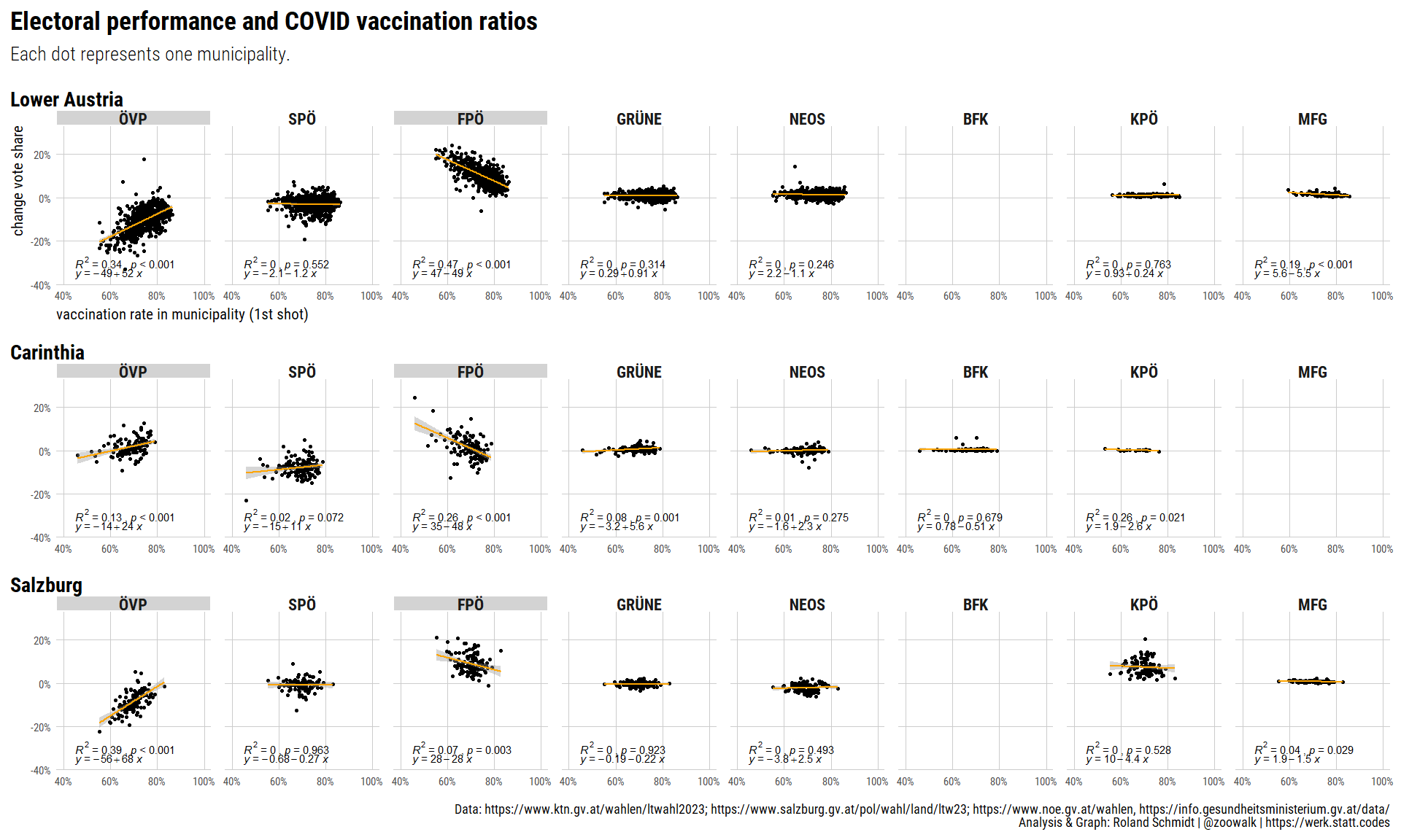
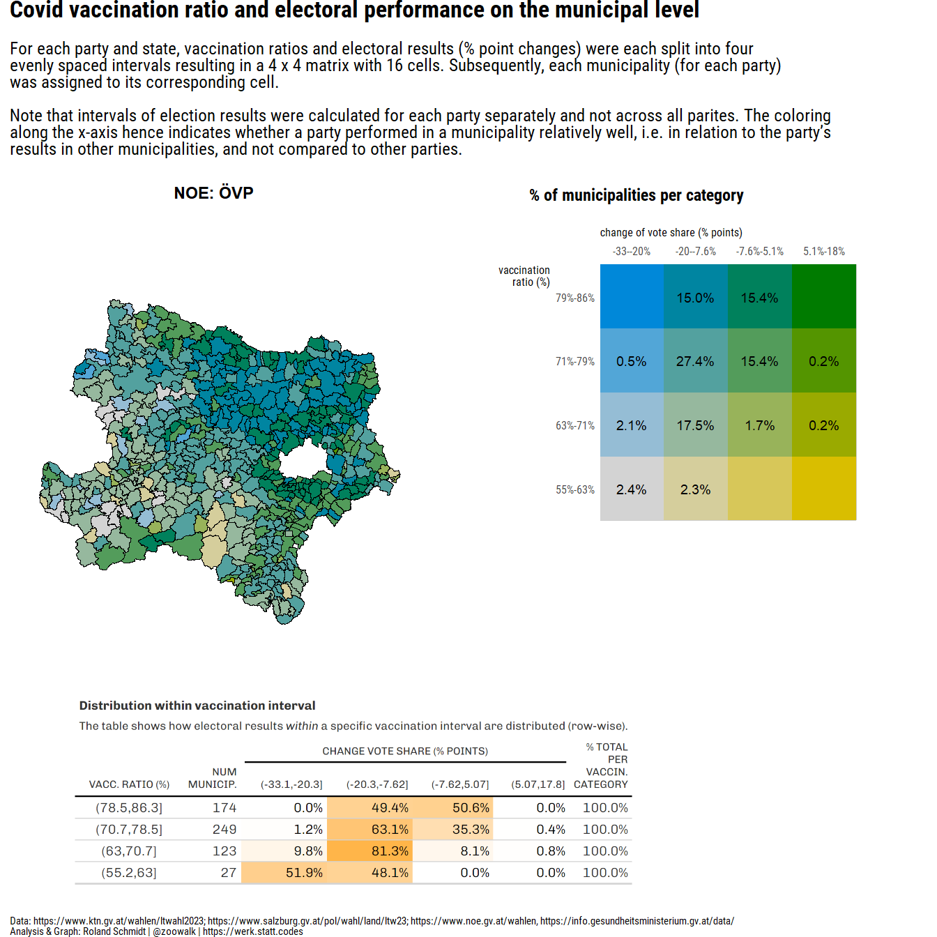
pl_1 <- ((plot_map+(plot_legend_2/plot_spacer()+plot_layout(ncol=1, nrow=2, heights=c(2,1)))+plot_layout(ncol=2, widths=c(2,2)))/((wrap_elements(table_png)+plot_spacer()+plot_layout(widths=c(3,1)))))+plot_layout(nrow=2, heights=c(4,2))+plot_annotation(
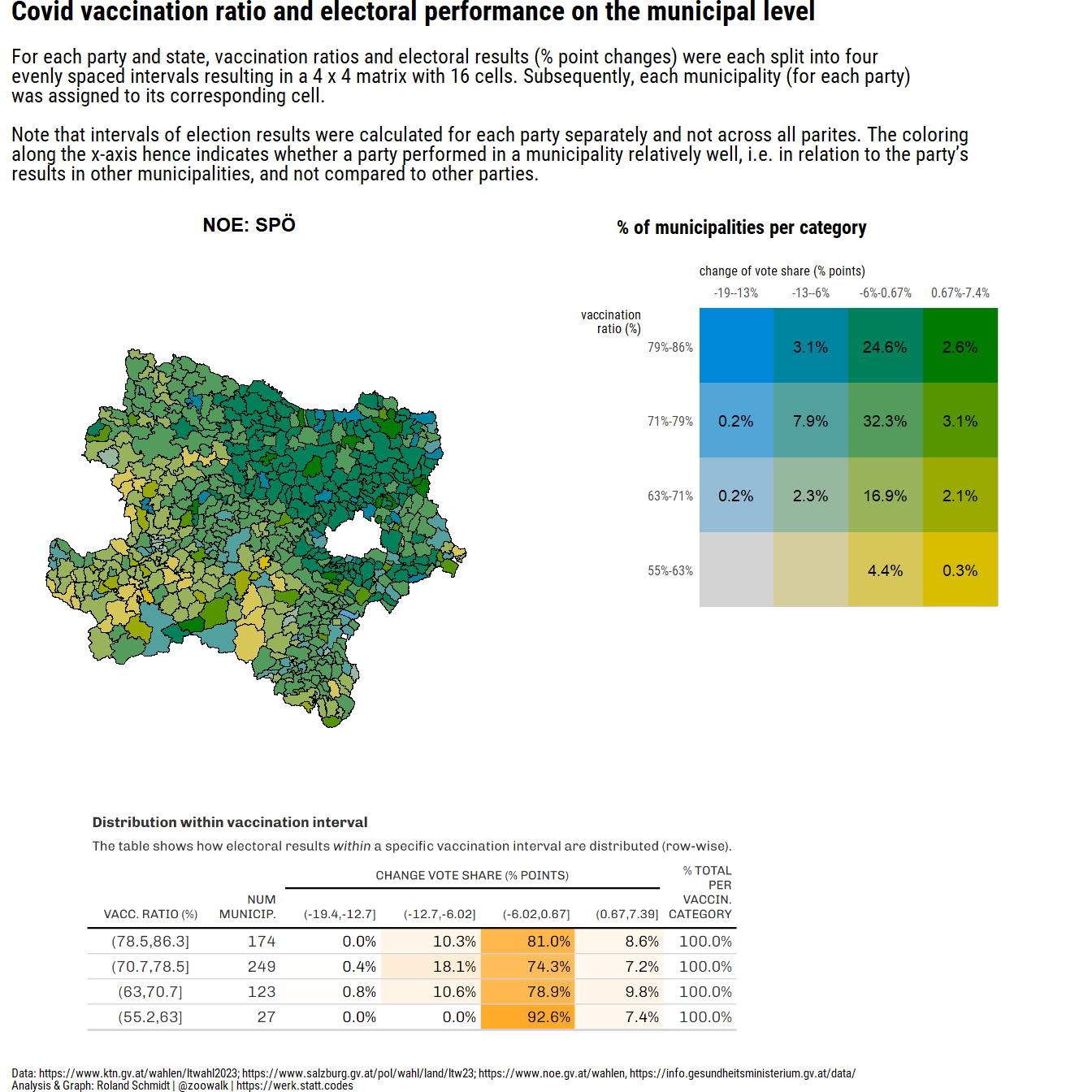
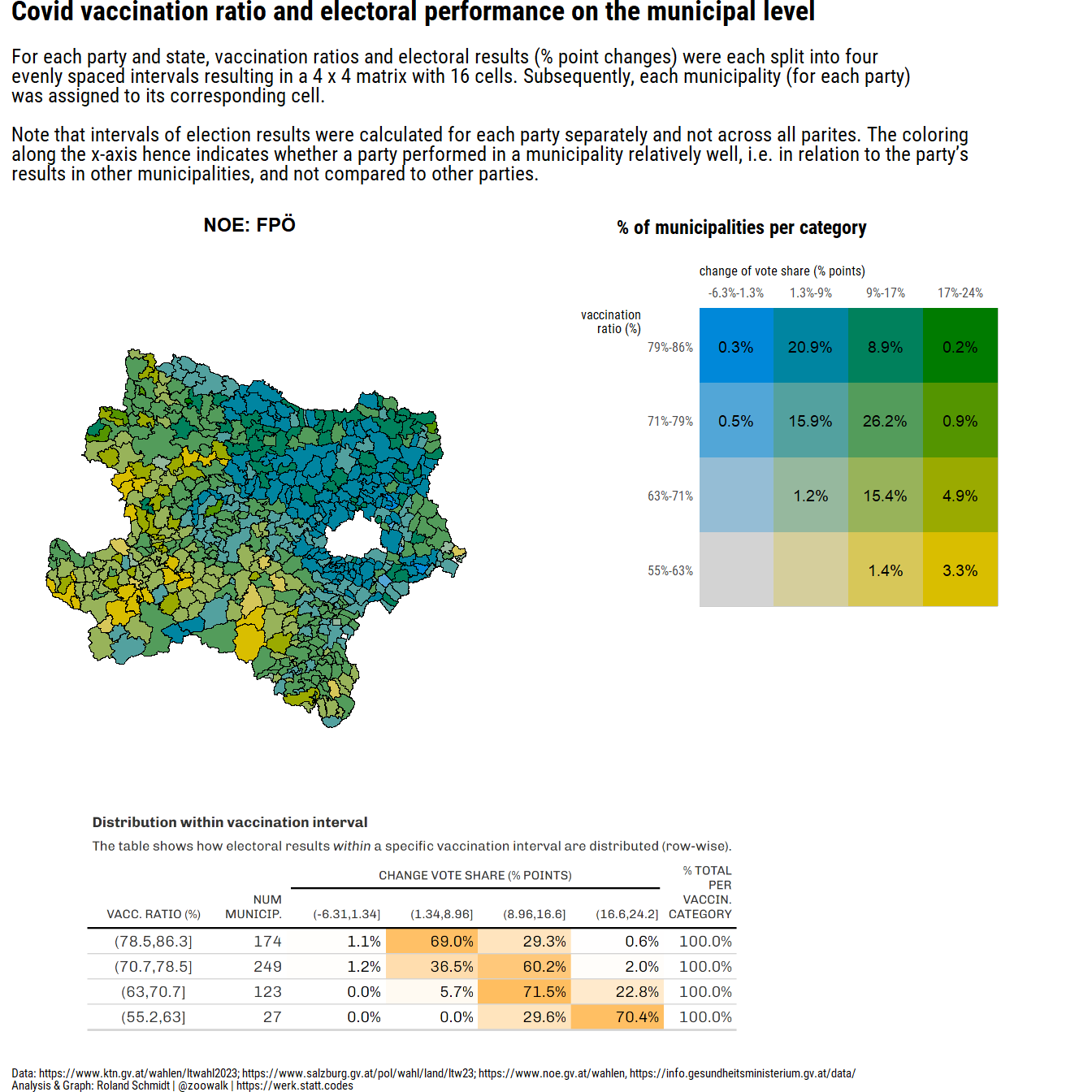
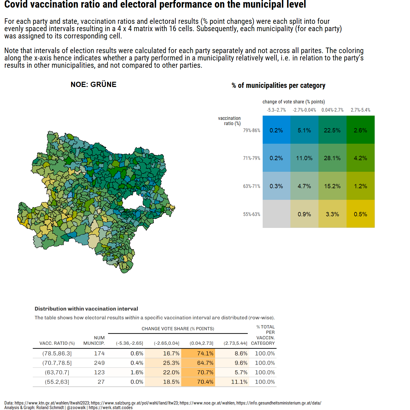
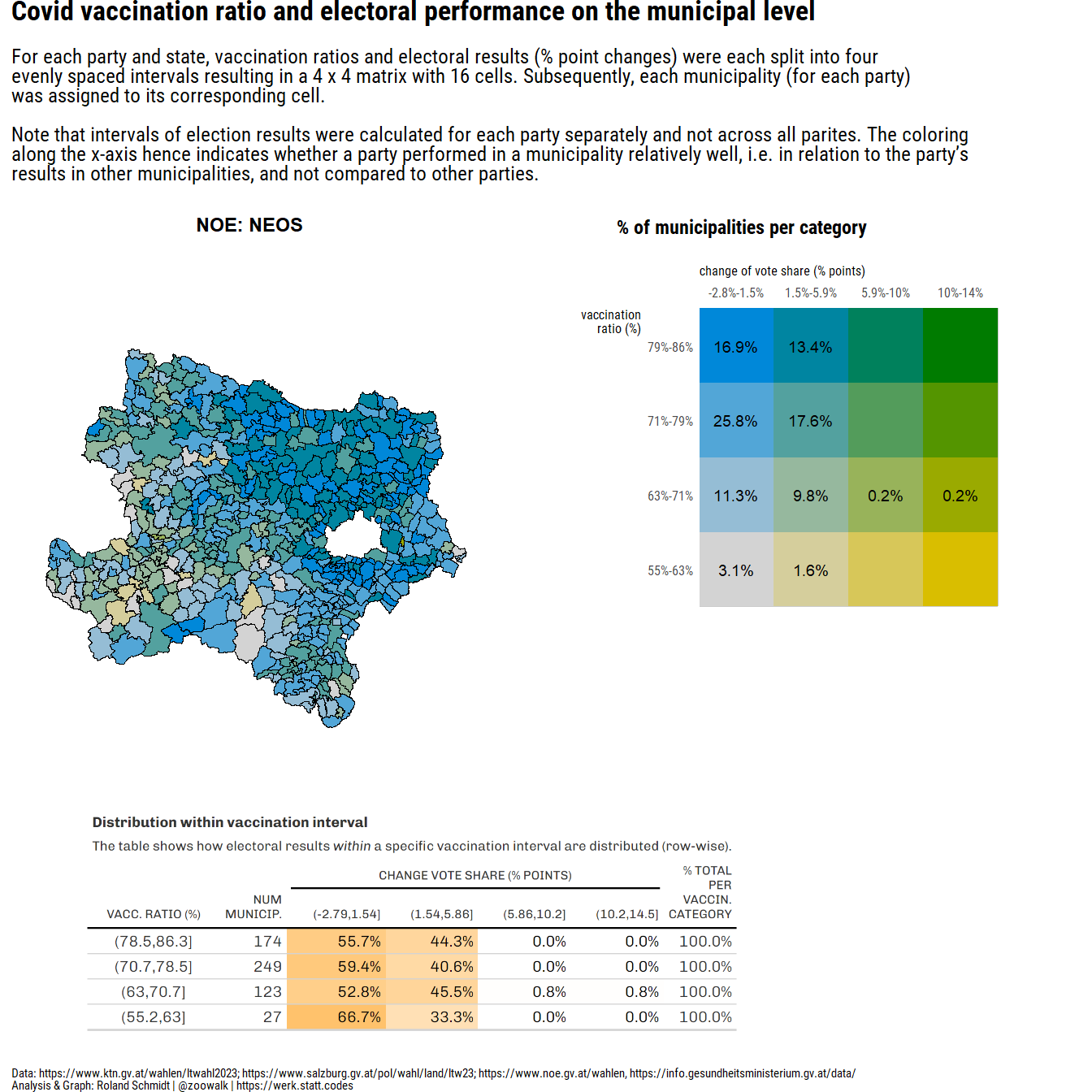
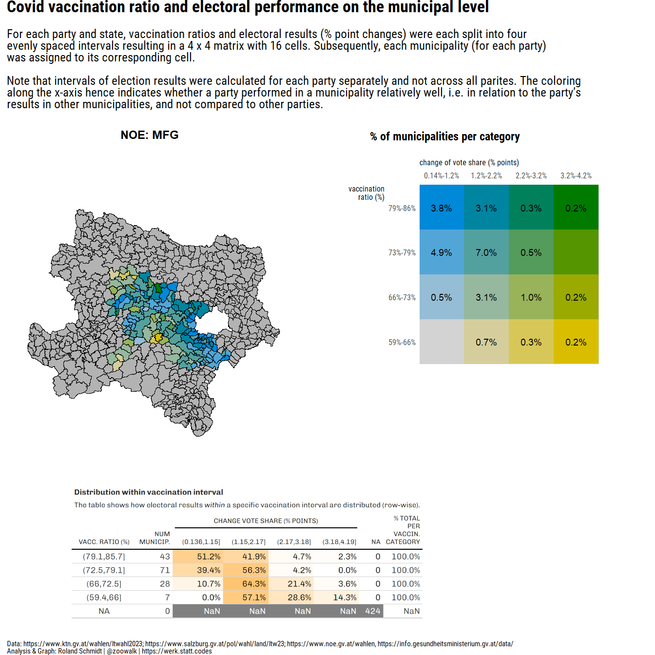
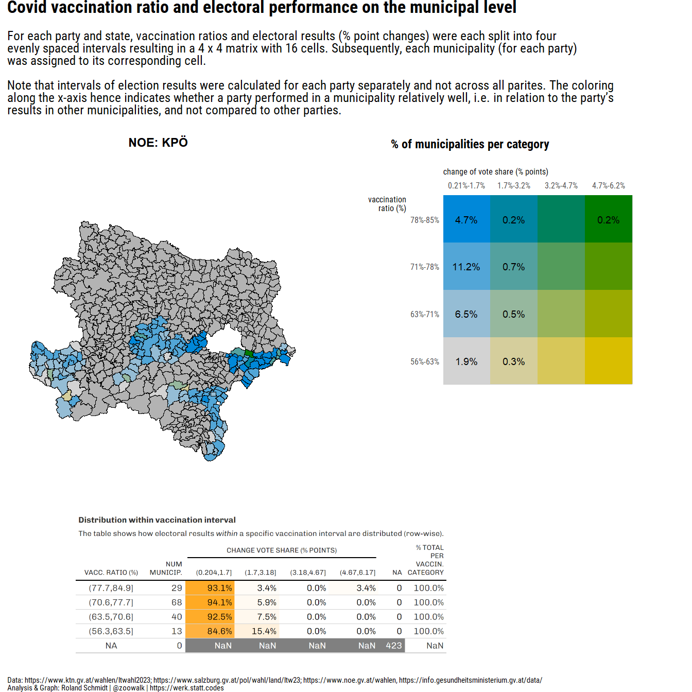
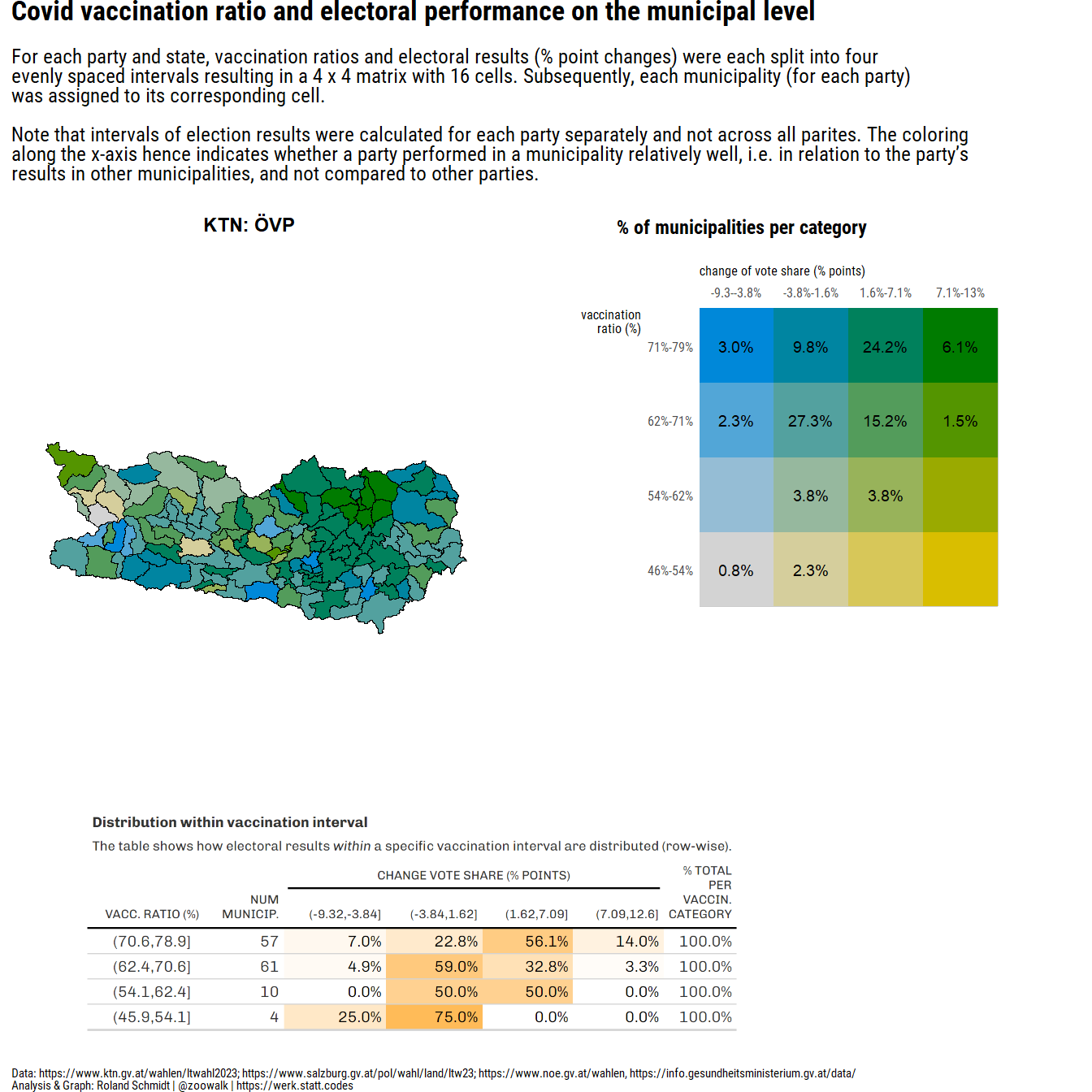
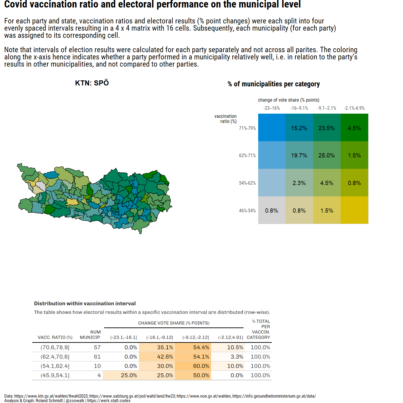
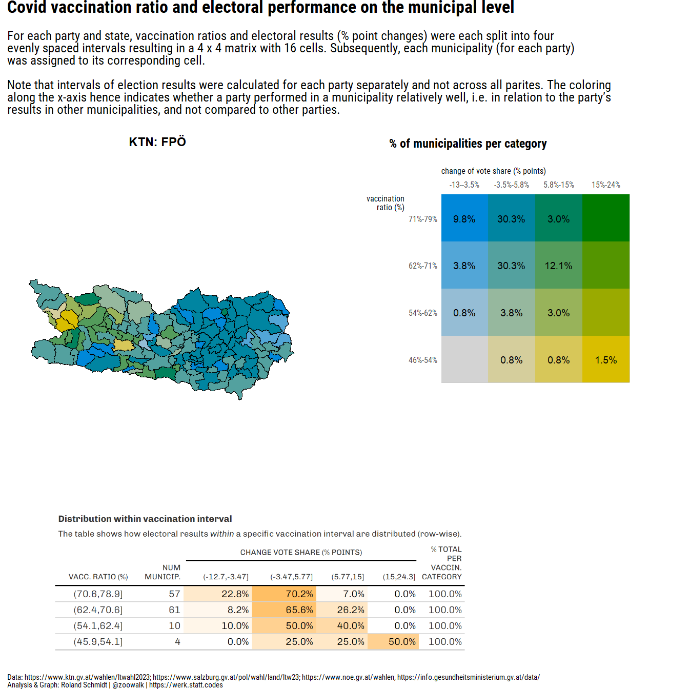
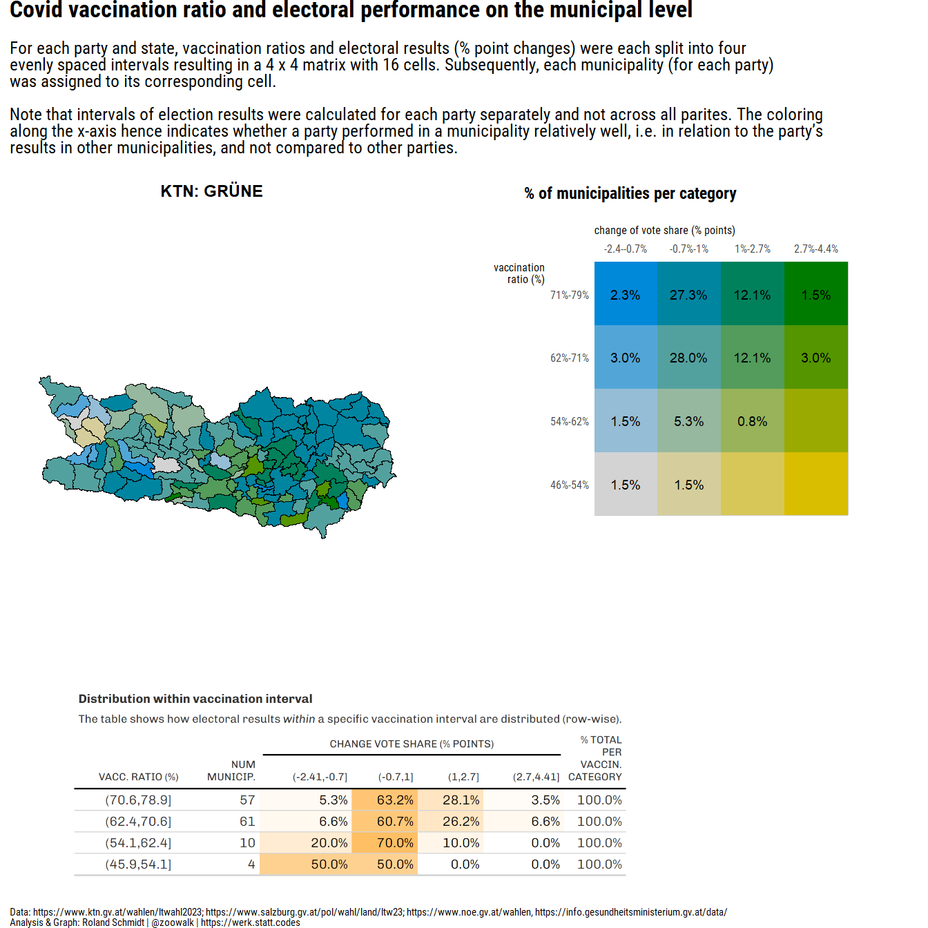
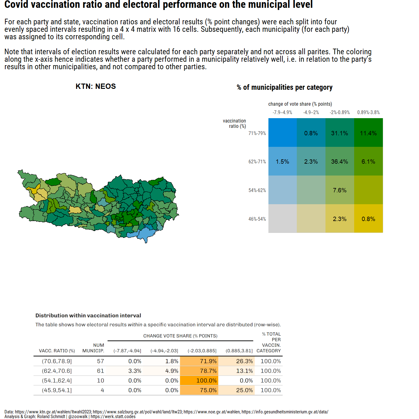
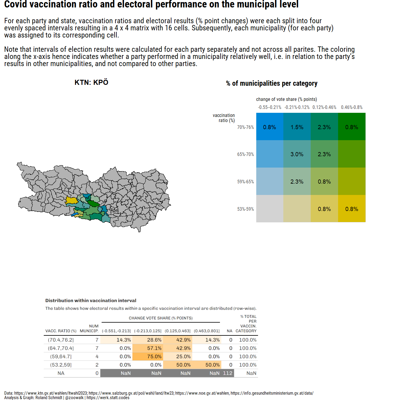
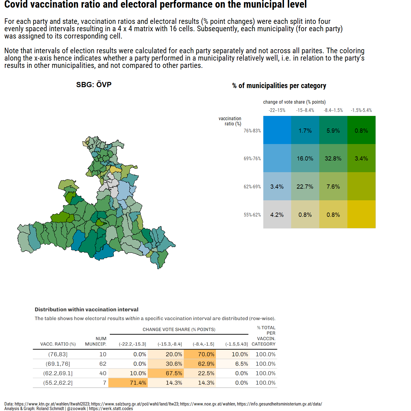
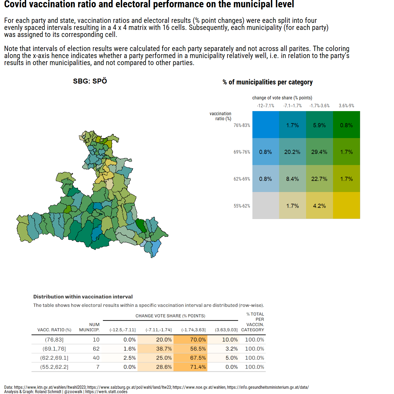
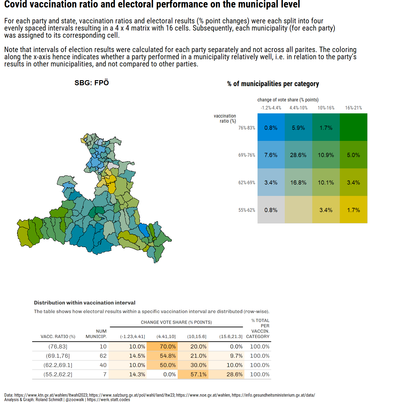
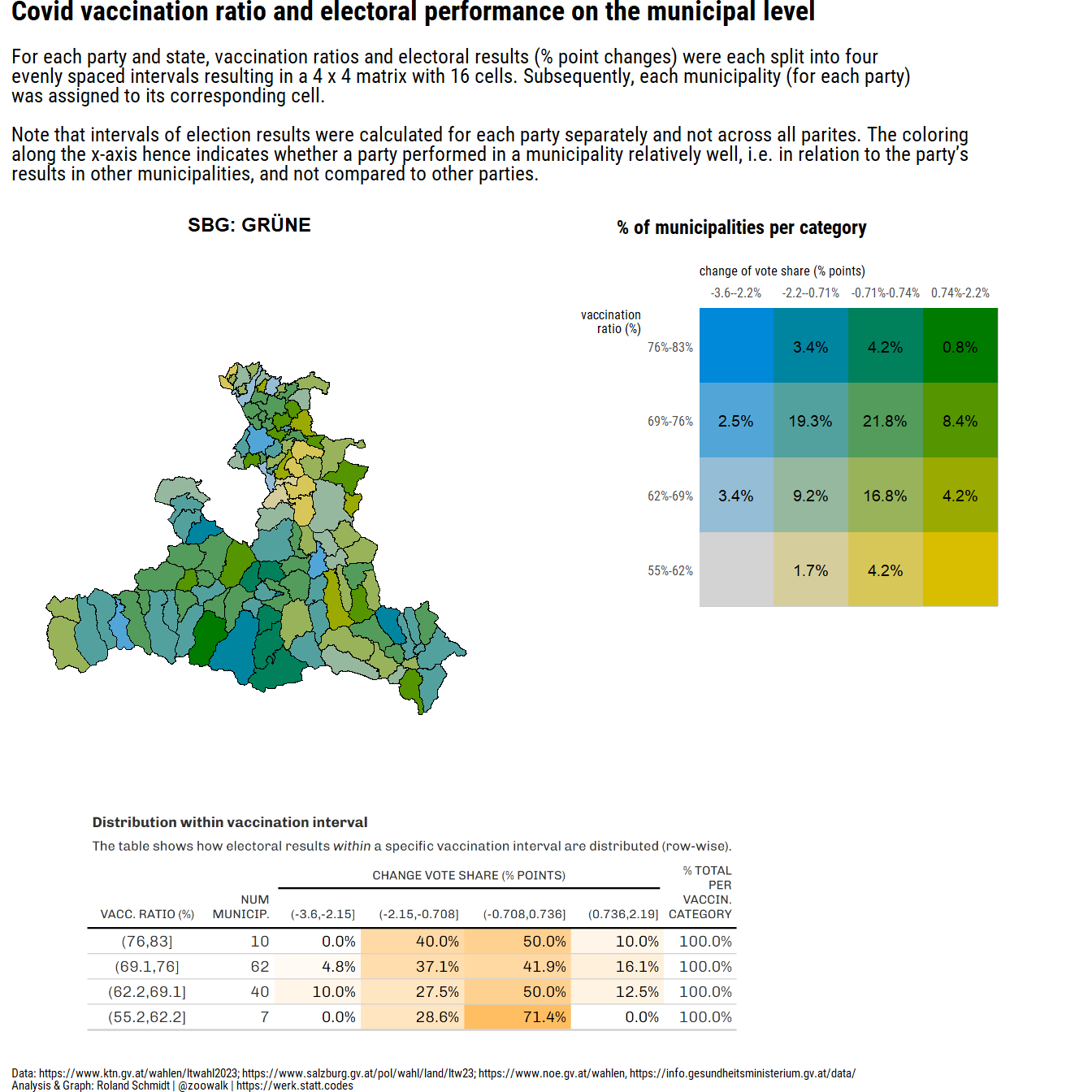
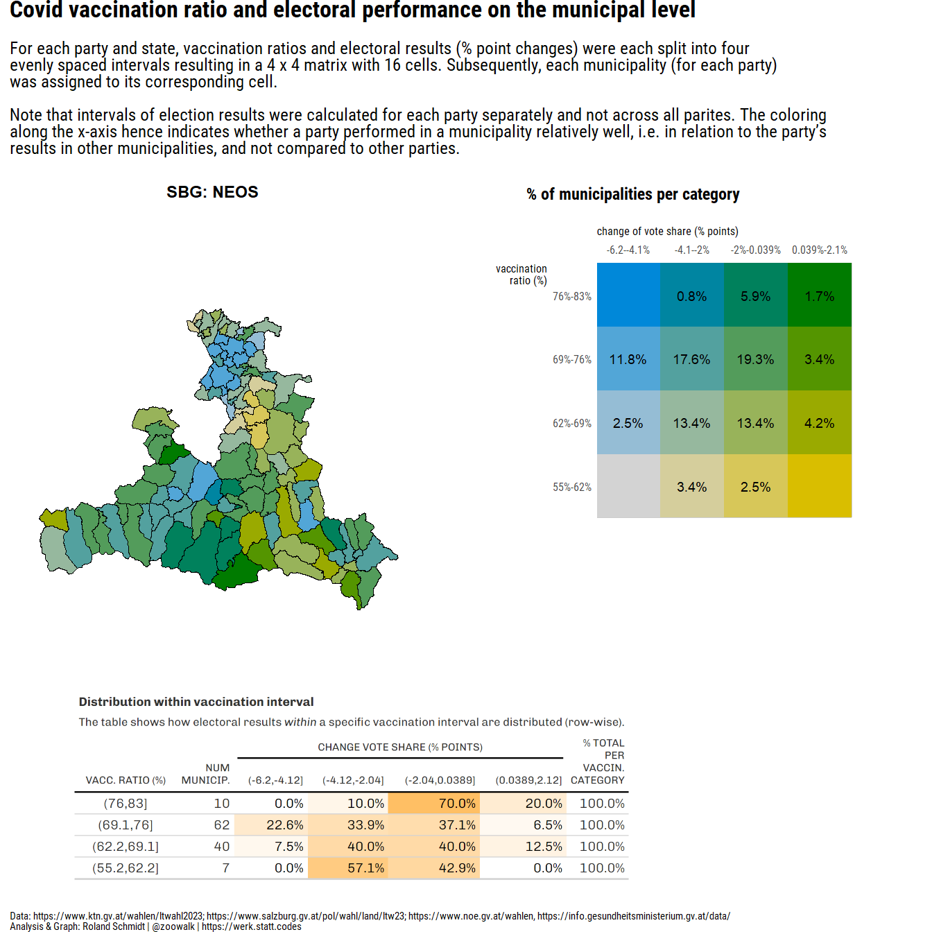
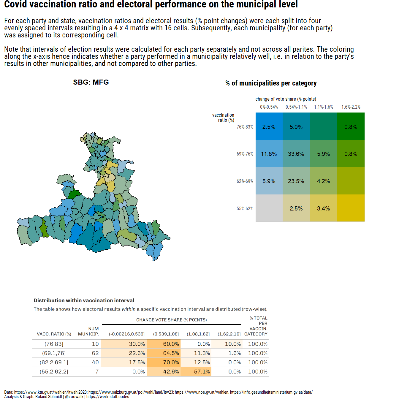
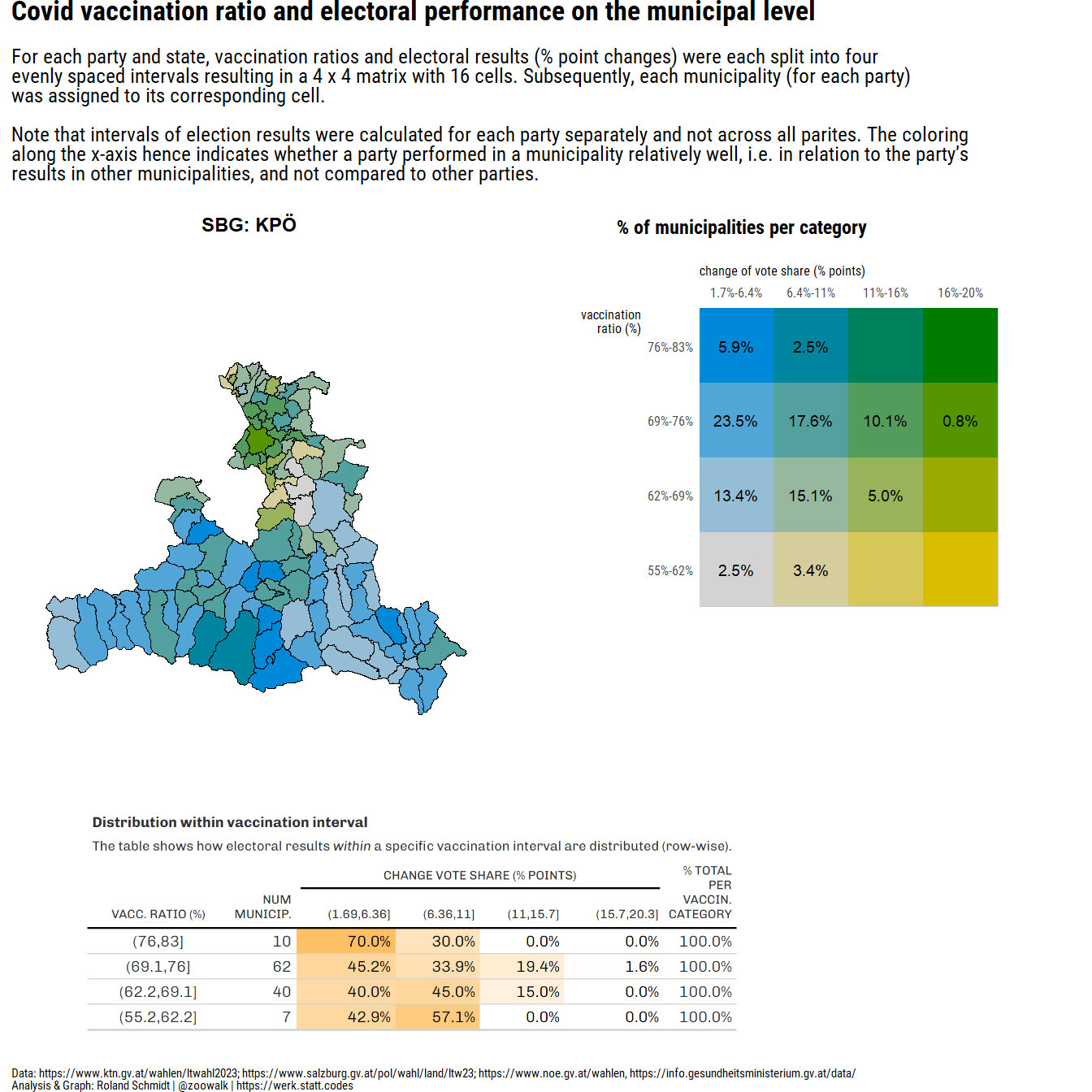
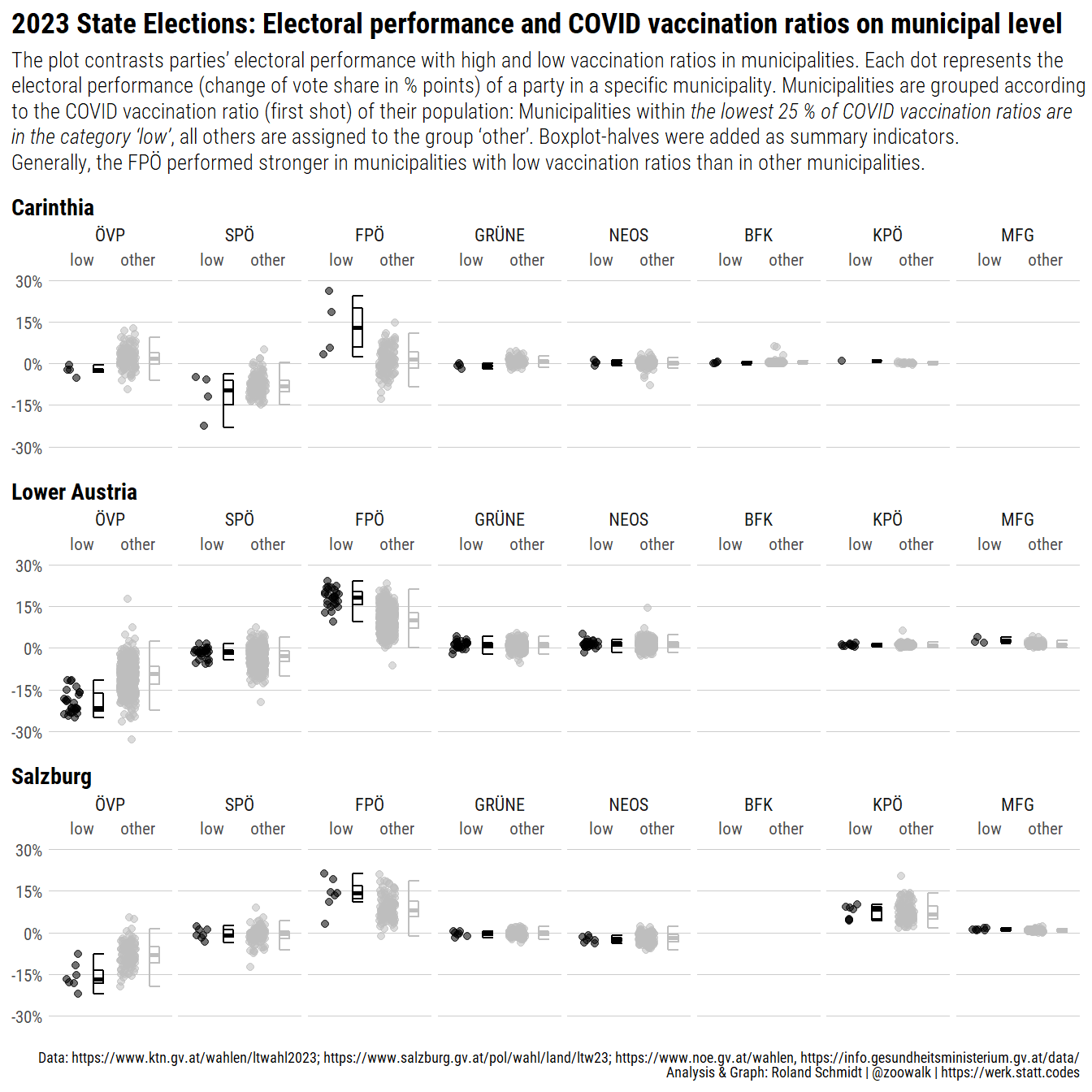
title="Covid vaccination ratio and electoral performance on the municipal level",
subtitle="For <span style='font-weight:bold;'>each party and state</span>, vaccination ratios and electoral results (% point changes) were each split into four <br>evenly spaced intervals resulting in a 4 x 4 matrix with 16 cells. Subsequently, each municipality (for each party)<br>was assigned to its corresponding cell.<br><br>Note that intervals of election results were calculated for each party separately and not across all parites. The coloring <br>along the x-axis hence indicates whether a party performed in a municipality relatively well, i.e. in relation to the party's <br>results in other municipalities, and not compared to other parties.",
caption=txt_caption,
theme=theme_ipsum_rc() +
theme(
plot.caption=element_markdown(
size=rel(.5),
hjust=0),
plot.subtitle=element_markdown(size=rel(.8)),
plot.title=element_markdown(size=rel(1.1)),
plot.margin=ggplot2::margin(0, unit="cm"))
)
pl_1# li_res <- list(pl_comb, tb_marginal)
# return(li_res)
}