Google’s Mobility reports: changes to mobility patterns during Covid-19 lock-down in Austria
COVID
Austria
Analysis of Google’s mobility reports following introduction of Covid lockdown in March 2020.
Author
Roland Schmidt
Published
28 Apr 2020
1 CONTEXT
Here’s a quick post related to Covid-19, but don’t be afraid, it won’t be another infection et al visualization (see here, but also here). Google and Apple recently released mobility reports which provide some insights on how the lockdown to curtail the epidemic’s spread affected individuals’ mobility patterns. While Apple’s reports draw on to routing requests to its Apple Map service, Google’s mobility reports highlight how people’s (= mobile device owner who activated their geo-location) presence on specific type of places changed relatively to a baseline period preceding the outbreak of the crisis and the introduction of the lockdown. You can find more details about the dataset here.
The dataset has been quickly picked up by numerous media outlets and data analysts, I nevertheless thought it might be interesting to have a specific look at the data for Austria. Again, this is predominately an exercise in number crunching and not meant to suggest any specific insights of an epidemiological nature etc. I leave this to the actual experts.
On a more technical level, with this post I also want to highlight the wonderful geofacet package by Ryan Hafen (link). The package, which I used already in a previous post, is an extension to ggplot2, and allows you to arrange a plot’s facets to reflect the position of geographical units on a map. While the facets’ location is a simplification and will hardly reflect the precise and actual size of e.g. a federal state, the approach provides a lucid way of presenting data for different geographical areas.
As always, the entire code for this analysis is available on my github account here. If you see any glaring error etc, or if something is unclear, feel free to let me know, best via a direct message at twitter.
2 IMPORT DATA
But first, let’s import the data. Initially, Google had published only summary graphs (in pdfs) and not the underlying data (what prompted to some very elegant data extraction exercise). But gladly, by now, a csv-file with all data is available on the website.
A few things to highlight: When importing data, the readr package generally tries to ‘guess’ the data type (character, double etc.) by inferring it from the first 1000 lines of the imported data. In some instances, this might not be sufficient or misleading. The col_types argument allows to manually specify each column, with first characters as convenient abbreviations (c = character, D = date, d = double etc). For details see here. Dplyr 1.0 will provide an option to define the location of a newly created column with the .after/.before argument.
Code
# import csv --------------------------------------------------------------# file_link <- "https://www.gstatic.com/covid19/mobility/Global_Mobility_Report.csv"# # df_global <- readr::read_csv(file=file_link, col_types = "ccccDdddddd")df_AT_mobility <- readr::read_csv2(file=here::here("posts", "2020-04-28-google-s-mobility-reportsmd", "AT_mobility_report.csv"))df_AT <- df_AT_mobility %>%filter(country_region_code=="AT") %>%mutate(date=as.Date(date)) %>%filter(date<as.Date("2020-05-01")) %>%mutate(sub_region_1=case_when(is.na(sub_region_1) ~"State level",TRUE~as.character(sub_region_1)))df_AT_long <- df_AT %>%pivot_longer(cols=contains("baseline"),names_to="type",values_to="value") %>%mutate(week.day=lubridate::wday(date, label=T), .after=date) %>%mutate(sub_region_1=forcats::as_factor(sub_region_1))data_as_of <-max(df_AT_long$date, na.rm = T)#ad description of place types from Google's documentationdf_AT_long <- df_AT_long %>%mutate(place.description=case_when(str_detect(type, "retail") ~"‘places like restaurants, cafes, shopping centers, theme parks, museums, libraries, and movie theaters.’",str_detect(type, "grocery") ~"’places like grocery markets, food warehouses, farmers markets, specialty food shops, drug stores, and pharmacies.’",str_detect(type, "park") ~"‘places like local parks, national parks, public beaches, marinas, dog parks, plazas, and public gardens.’",str_detect(type, "transit") ~"‘places like public transport hubs such as subway, bus, and train stations.’",str_detect(type, "work") ~"‘places of work’",str_detect(type, "residential") ~"‘places of residence’",TRUE~as.character("missing"))) %>%mutate(date=as.Date(date))
The mobility reports contain data on the following types of places:
# A tibble: 6 × 1
  type
  <chr>
1 retail_and_recreation_percent_change_from_baseline
2 grocery_and_pharmacy_percent_change_from_baseline
3 parks_percent_change_from_baseline
4 transit_stations_percent_change_from_baseline
5 workplaces_percent_change_from_baseline
6 residential_percent_change_from_baseline
To distinguish mobility patterns prior and during the lockdown we need to define the relevant dates.
Code
# set dates ---------------------------------------------------------------date.start.lockdown <-as.Date("2020-03-16")date.opening.shops <-as.Date("2020-04-14")df_dates <-tibble(date.start.lockdown=date.start.lockdown,date.opening.shops=date.opening.shops) %>%pivot_longer(cols=everything(),names_to ="event",values_to="date")
3 GEOFACET GRID
For geofacet to be able to position ggplot’s facets in (approximate) accordance with units’ actual geographical location, it requires a grid which specifies each facet’s relative location. The package comes already with a number of predefined grids, and users can upload newly made grids to the package’s github. For the present case, I created a new one defining the location of Austria’s nine federal states. As suggested by the package’s maintainer, the code are ISO-3166-2 codes. The new grid is now uploaded to geofacet’s github and can be called by other users by the name AUT_states_grid.
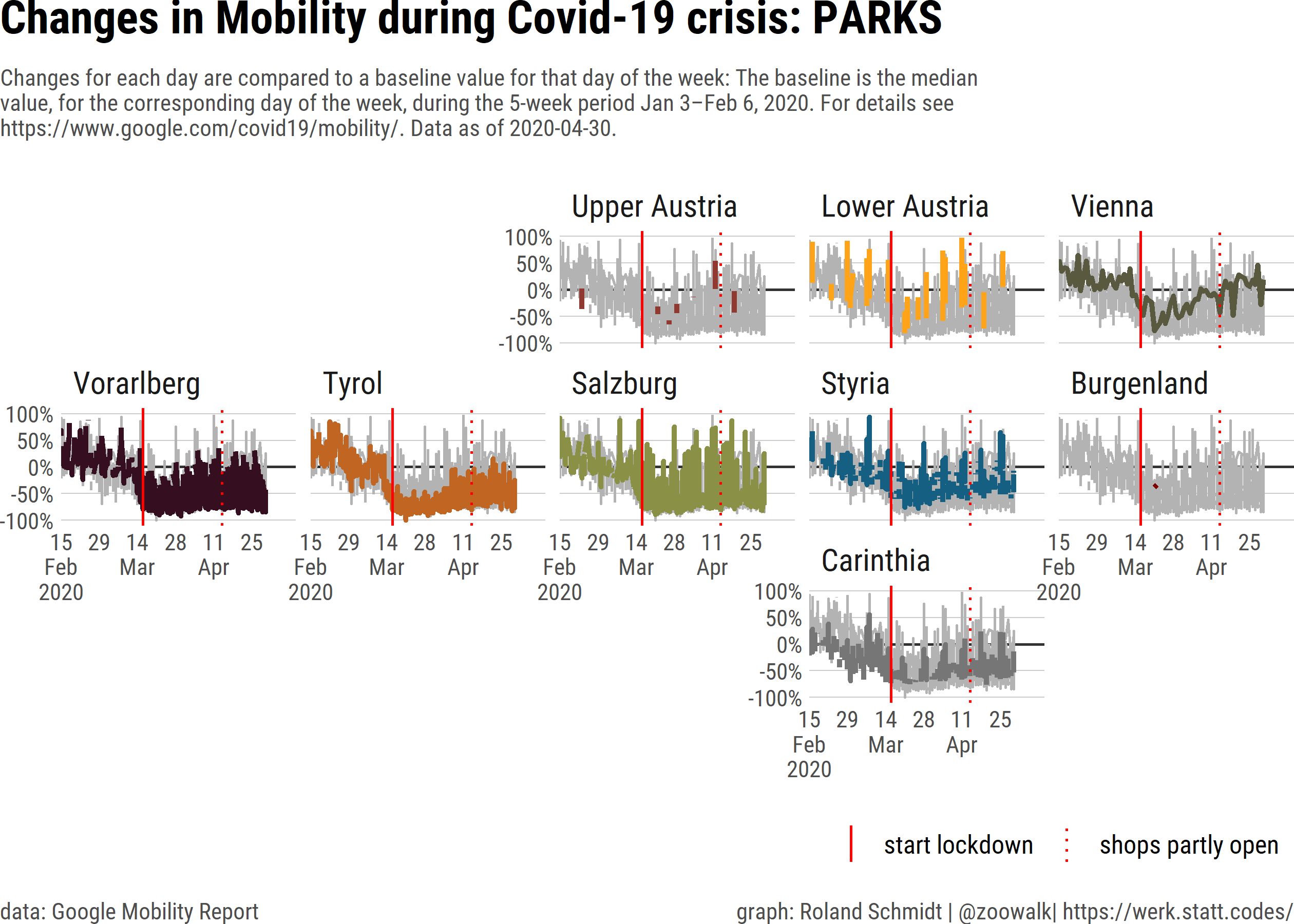
As mentioned above, the mobility reports contain data on specific types of places. Let’s plot the dynamics for one of them: Parks.
Code
txt_subtitle <- glue::glue("Changes for each day are compared to a baseline value for that day of the week: The baseline is the median value, for the corresponding day of the week, during the 5-week period Jan 3–Feb 6, 2020. For details see https://www.google.com/covid19/mobility/. Data as of {data_as_of}.")date_shutdown <-as.Date("2020-03-16")df_AT_long_type <- df_AT_long %>%filter(str_detect(type, "parks")) %>%filter(!str_detect(sub_region_1, "State")) pl_map <- df_AT_long_type %>%ggplot()+labs(title=paste("Changes in Mobility during Covid-19 crisis:", str_to_upper(str_remove_all(unique(df_AT_long_type$type), regex("_percent.*$")))),subtitle=str_wrap(txt_subtitle, 130),caption=c("data: Google Mobility Report", "graph: Roland Schmidt | @zoowalk| https://werk.statt.codes/"))+geom_hline(yintercept=0,color="grey20")+geom_line(data=df_AT_long %>%filter(str_detect(type, "parks")) %>%filter(!str_detect(sub_region_1, "State")) %>%rename(all_regions=sub_region_1),aes(x=date,y=value,group=all_regions),color="grey70",show.legend=F,stat="identity") +geom_line(aes(x=date,y=value,color=sub_region_1),show.legend=F,size=1)+geom_vline(data=df_dates,aes(xintercept=date,linetype=event),color="red")+scale_linetype_manual(values=c(date.opening.shops="dotted",date.start.lockdown="solid"),labels=c(date.opening.shops="shops partly open",date.start.lockdown="start lockdown"))+theme_ipsum_rc()+scale_x_date(labels = scales::label_date_short(),expand=expansion(mult=c(0, 0.15)),breaks =c(seq.Date(min(df_AT_long$date), max(df_AT_long$date), by="2 week"))) +scale_y_continuous(labels=scales::label_percent(accuracy =1,scale=1),limits=c(-100, 100))+scale_color_paletteer_d("ggsci::default_uchicago")+theme(axis.title.x =element_blank(),axis.text.x =element_text(size =9),axis.text.y =element_text(size =9),axis.title.y=element_blank(),panel.grid.major.x =element_blank(),panel.grid.minor.x =element_blank(),panel.grid.minor.y =element_blank(),strip.text.y =element_text(angle =0, vjust =1),legend.position ="bottom",legend.justification ="right",legend.key.size=unit(0.5, "cm"),legend.key.height =unit(0.5, "cm"),legend.title =element_blank(),legend.text =element_text(size=10),# plot.title = element_text(size = 12),panel.spacing.x =unit(0.2, "cm"),panel.spacing.y =unit(0.1, "cm"),plot.margin=margin(l=0, r=0, unit="cm"),plot.title.position ="plot",plot.subtitle =element_text(size=9, color="grey30"),plot.caption.position ="plot",plot.caption =element_text(hjust =c(0, 1), color ="grey30"),plot.background =element_rect(fill=plot_bg_color, color=plot_bg_color) )+facet_geo(~sub_region_1, grid = AUT_states_grid)+guides(linetype =guide_legend(override.aes =list(colour ="red",direction="vertical"),reverse = T),colour ="none")
Before diving into the interpretation let’s recall what the displayed values actually mean. In Google’s own words
‘the data show how visits and lengths of stay at different places change compared to a baseline. Changes for each day are compared to a baseline value for that day of the week. The baseline is the median value, for the corresponding day of the week, during the 5-week period Jan 3–Feb 6, 2020. The changes are based on data from users who have opted-in to Location History for their Google Account, so the data represents a sample of users.’
So with this in mind, let’s look at the graph which depicts the presence in parks. The colored line is the values for the state, grey lines are the values for all other states for the sake of contrast.
I think it’s pretty clear that either slightly before or from the introduction of the lockdown onward, individuals’ presence in parks decreased considerably. At a closer look, a few variations appear.
When it comes to the period before the lockdown, the values for Vorarlberg, Tyrol, Salzburg and Carinthia started decreasing from a relative high level already prior to the lockdown. I don’t have any definite answer for that, but I could imagine that mid-February the skiing season had a final peak with schools (e.g. in Germany) having a term break and tourists flocking in strong numbers to the slopes (compared to the baseline). Subsequently, with the skiing season coming to a gradual end, the high numbers started to decrease. But again, whether this dynamic had an impact on parks is purely speculative. In contrast, in most of the other states, the presence level in parks was rather stable prior to the lockdown.
By and large, the lockdown on 16 March lead to a clearly visible reduction in parks. Oddly, there seems to have been some delay in lockdown’s impact in Lower Austria and Burgenland.
There is also some variation when it comes to the dynamics during the lockdown. While the presence in parks stayed in most states on a comparably low level, Lower Austria, Burgenland and Upper Austria gradually ‘rebounded’ and the individuals’ presence in parks increased again to pre-lockdown levels. Also in Vienna, the presence in parks grew, albeit slower and so far not beyond the baseline level. I don’t have any explanation for that, but could imagine that it has something to do with individuals’ options to leave their flat to get some fresh air. While in more urban states, parks are the probably the destination of choice, more rural states offer a variety of other ‘escapes’. But that’s only me speculating here.
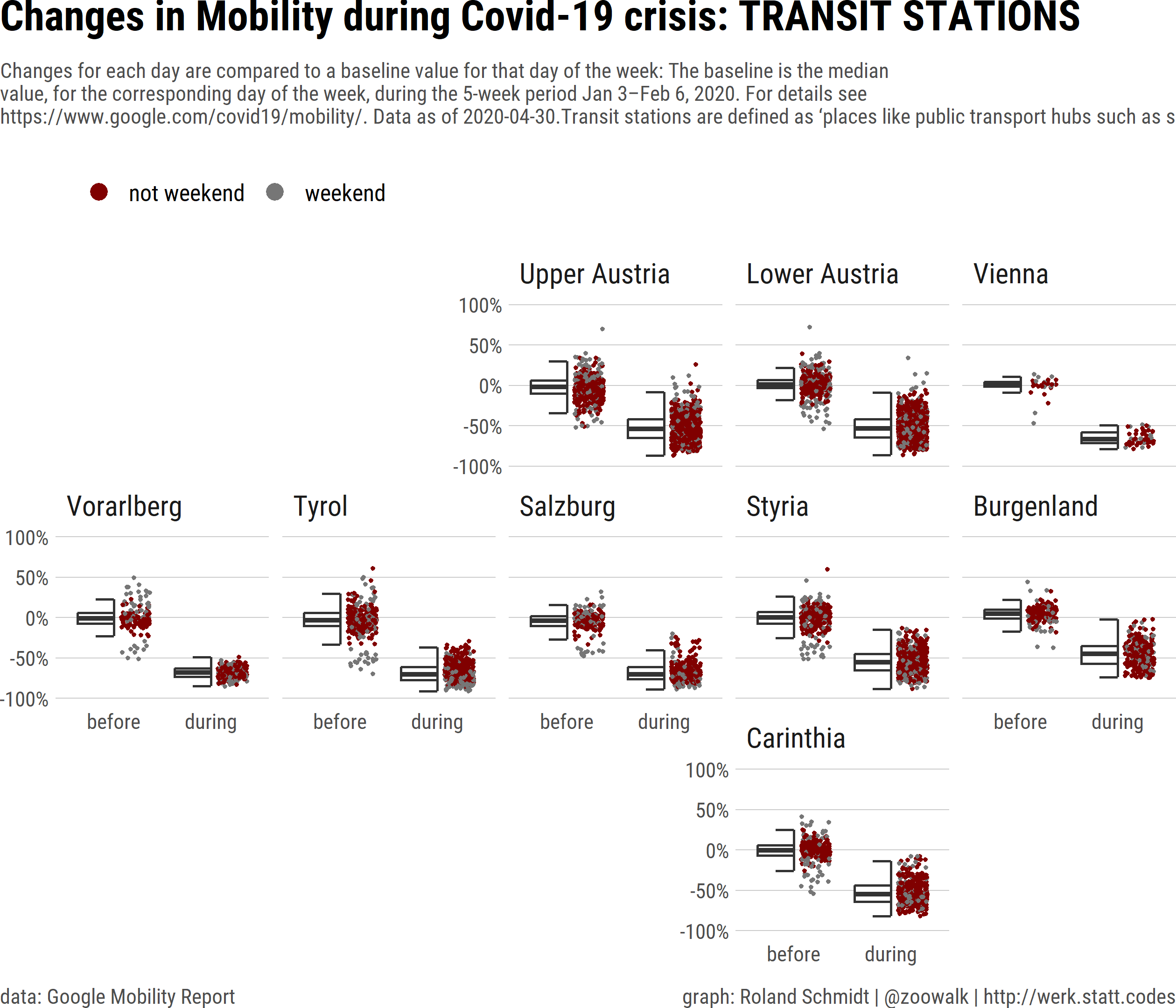
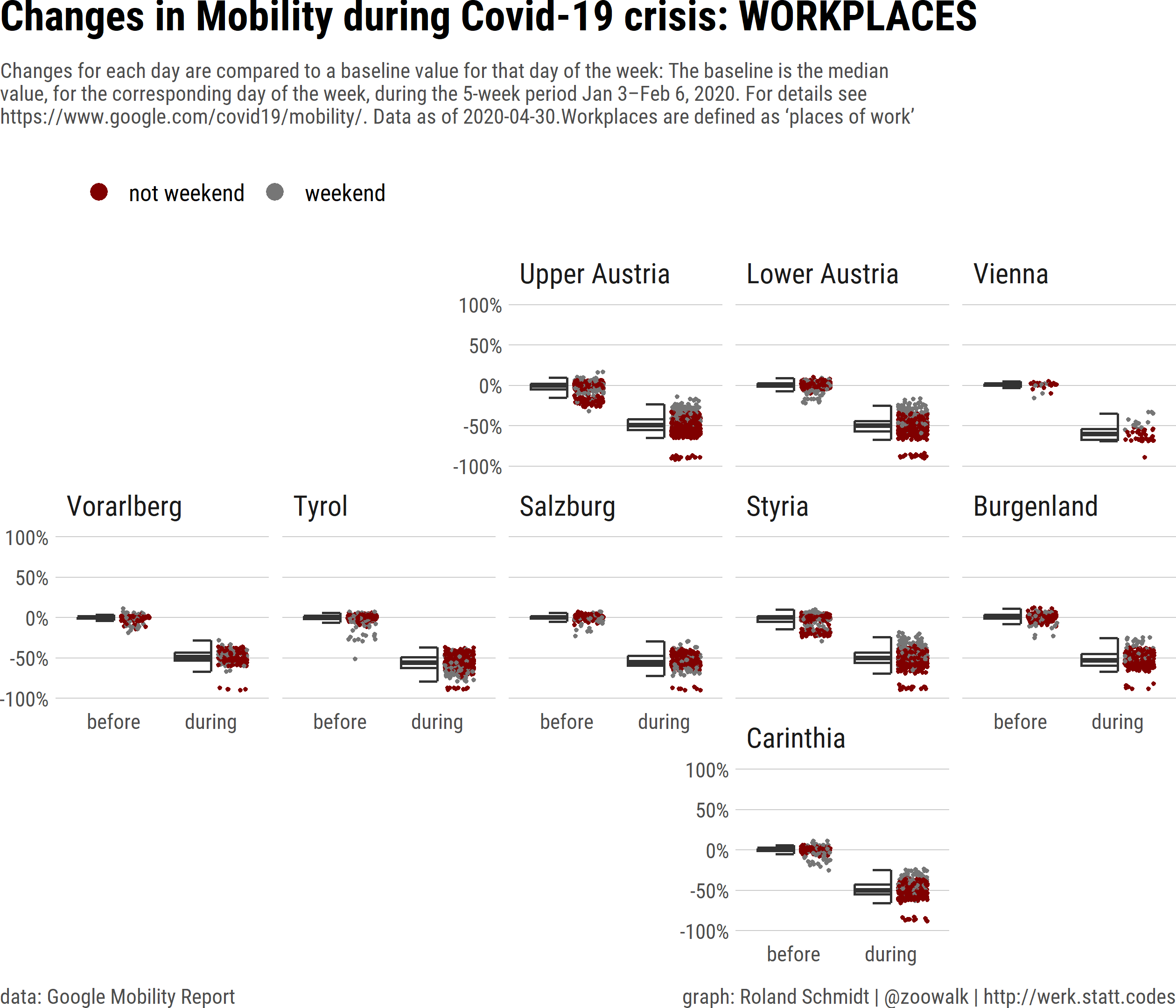
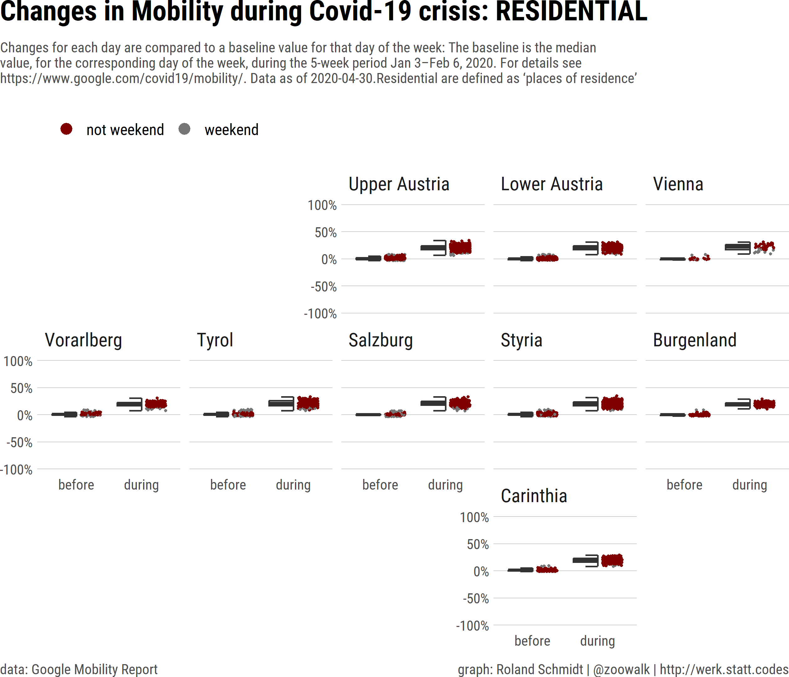
5 BOXPLOT ON ALL TYPES OF PLACES
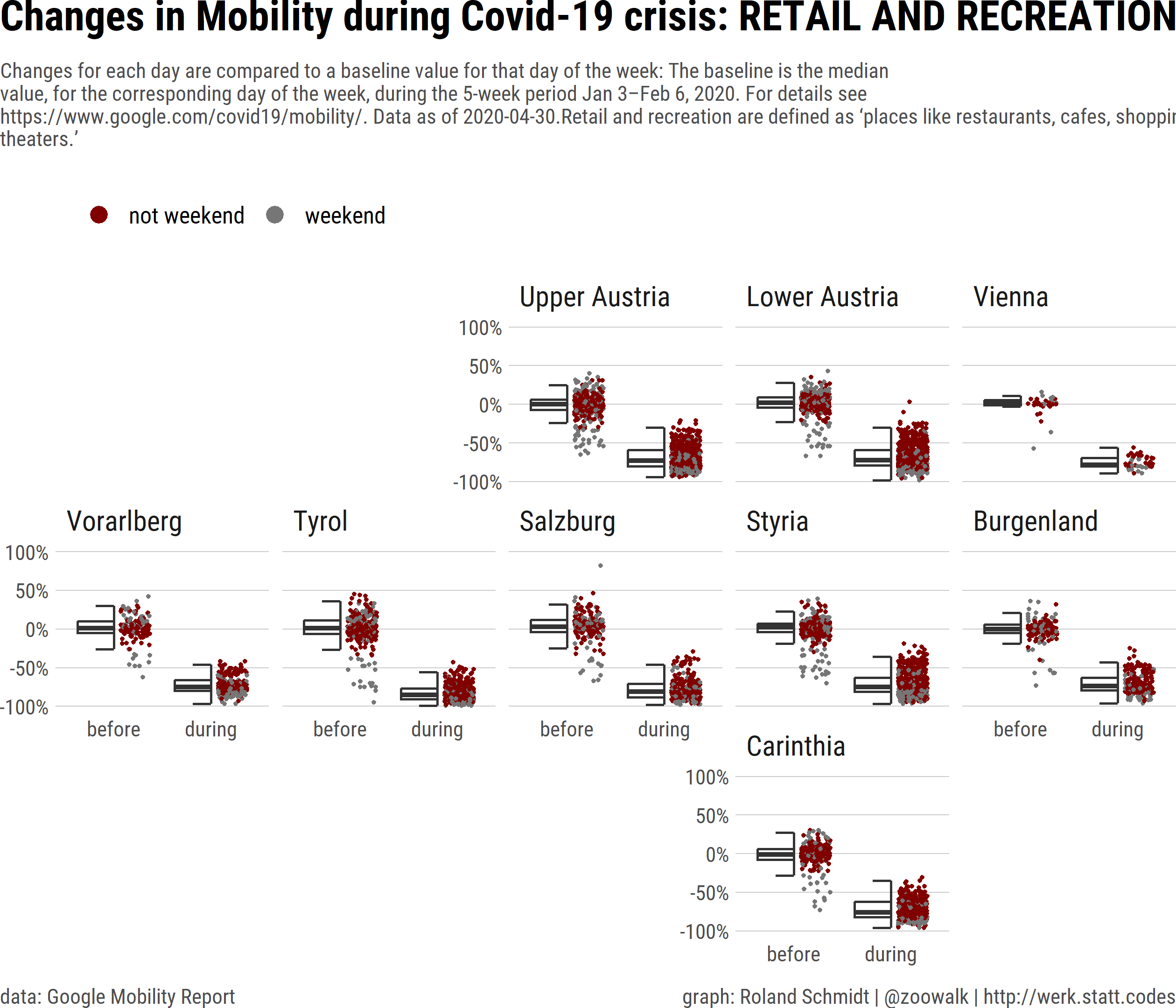
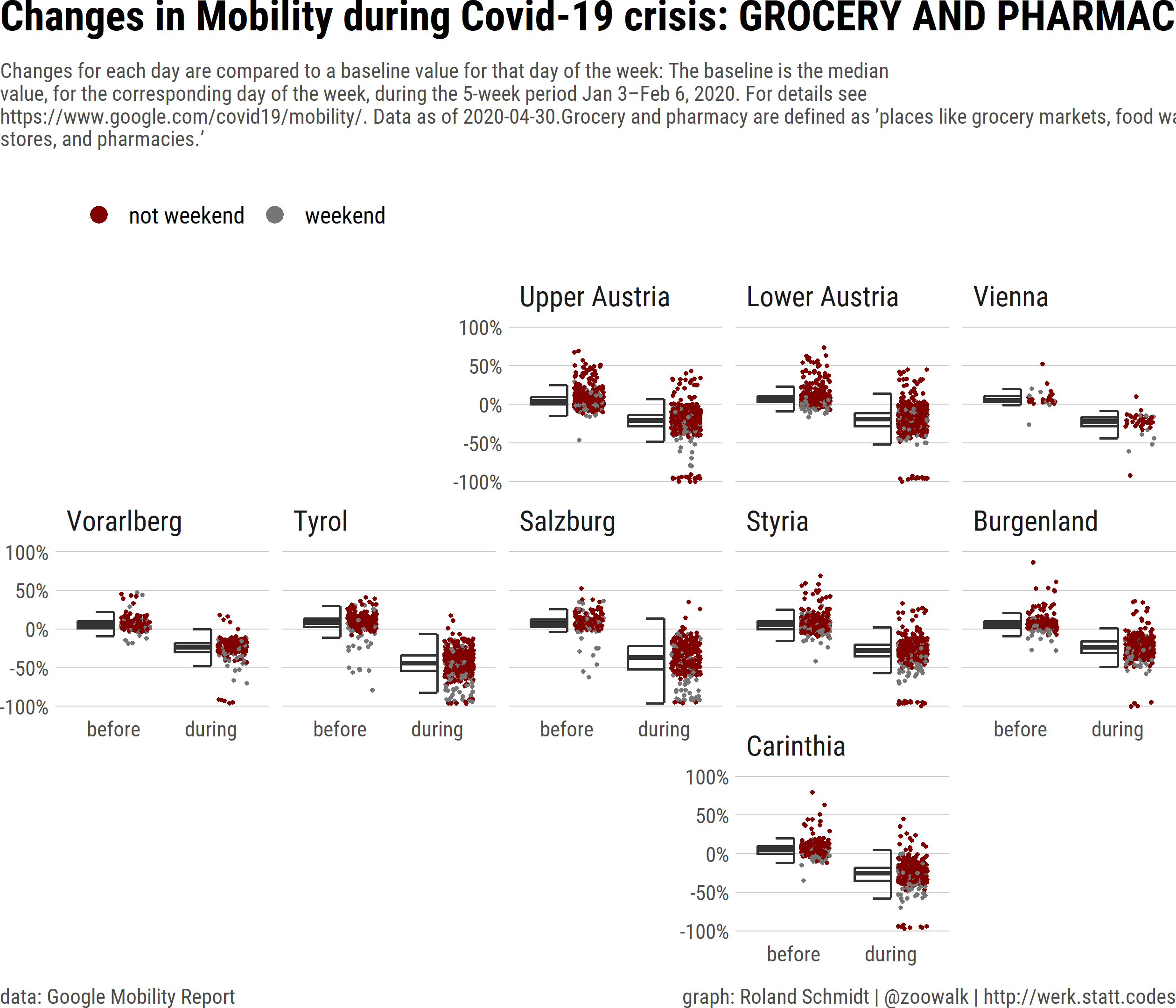
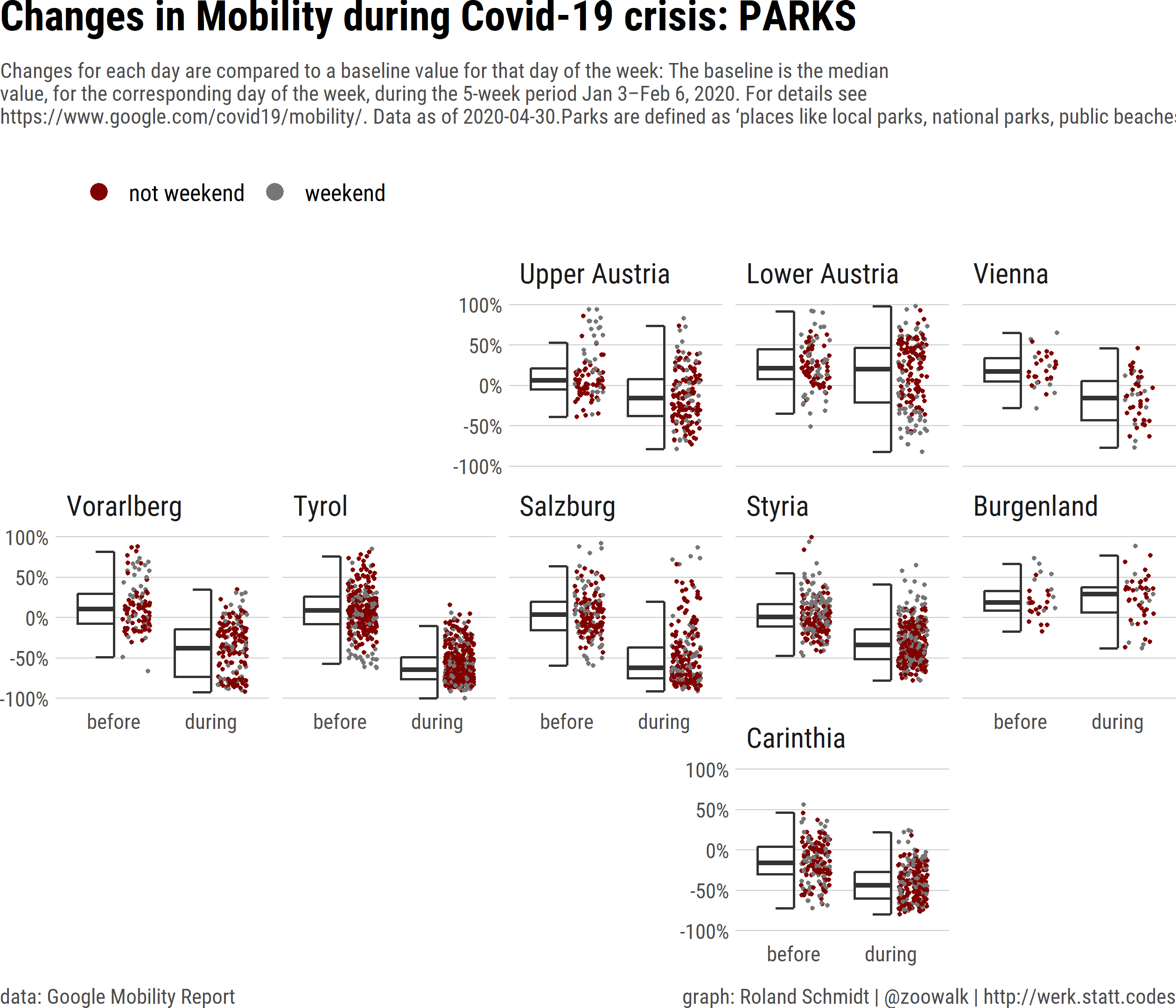
Finally, to better distill the changes between before and during the lockdown as well as between the federal states, the plots below present (half) a boxplot summarizing the relative changes of mobility patterns for all types of places provided in Google’s mobility reports. To supplement the boxplot, I also plot the actual values for each day (= each dot) which represent the relative change of each day to the corresponding weekday in the baseline period. The package gghalves allows for combining ‘half’ plots of two types. Iterating the ggplot command over all types of places covered by Google’s mobility reports gives us one map per place type.
To see whether weekends are in any way different, I marked them in red.
Again, I’ll refrain from what might become far-fetched interpretations, but what is noteworthy is the overwhelmingly narrow spread of values during the lockdown with the exception of parks. I was a bit puzzled by the relatively weak increase of stays in residential areas compared to the baseline period. Not sure what to make of this.