With the COVID epidemic taking a pretty firm grip on our lives, I thought I’ll use this post as a kind of analytic repository regarding the developments in Austria. There are certainly plenty of other, more advanced analyses out there, so see this as a kind of personal attempt to get a grip on the virus and what is happening around us. Hence, as a caveat, this is purely about crunching numbers. I am no epidemiologist, let alone physician who would have any substantive understanding of the matter. Yet, I think looking at ‘the data’ and bearing the above caveat in mind, can be a worthwhile exercise.
I will try to run the code generating this site once a day, so graphs and text will automatically update. If time permits, new analyses will be added. In terms of interpretation, I’ll be rather brief due to lack of time (kids are at home, partner on home office duty…), but I guess most of the graphs are self-explanatory.
As always, and since this is also a blog about R, you can find the code in the folded sections. If you think there is a glaring error etc., don’t hesitate and let me know (best via Twitter DM).
1 Getting data on the COVID-19
The data for this analysis is taken from Johns Hopkins COVID-19 data repository, which seems to be one of, if not the most frequently used data source on Covid-19. Have a look at their site for more details.
Get the raw data from the repository with the readr package, clean the names with janitor; then flip the data into a long format, and summarize to get country totals (as opposed to amounts for subregions). The datatable function from the DT package quickly produces a searchable html table.
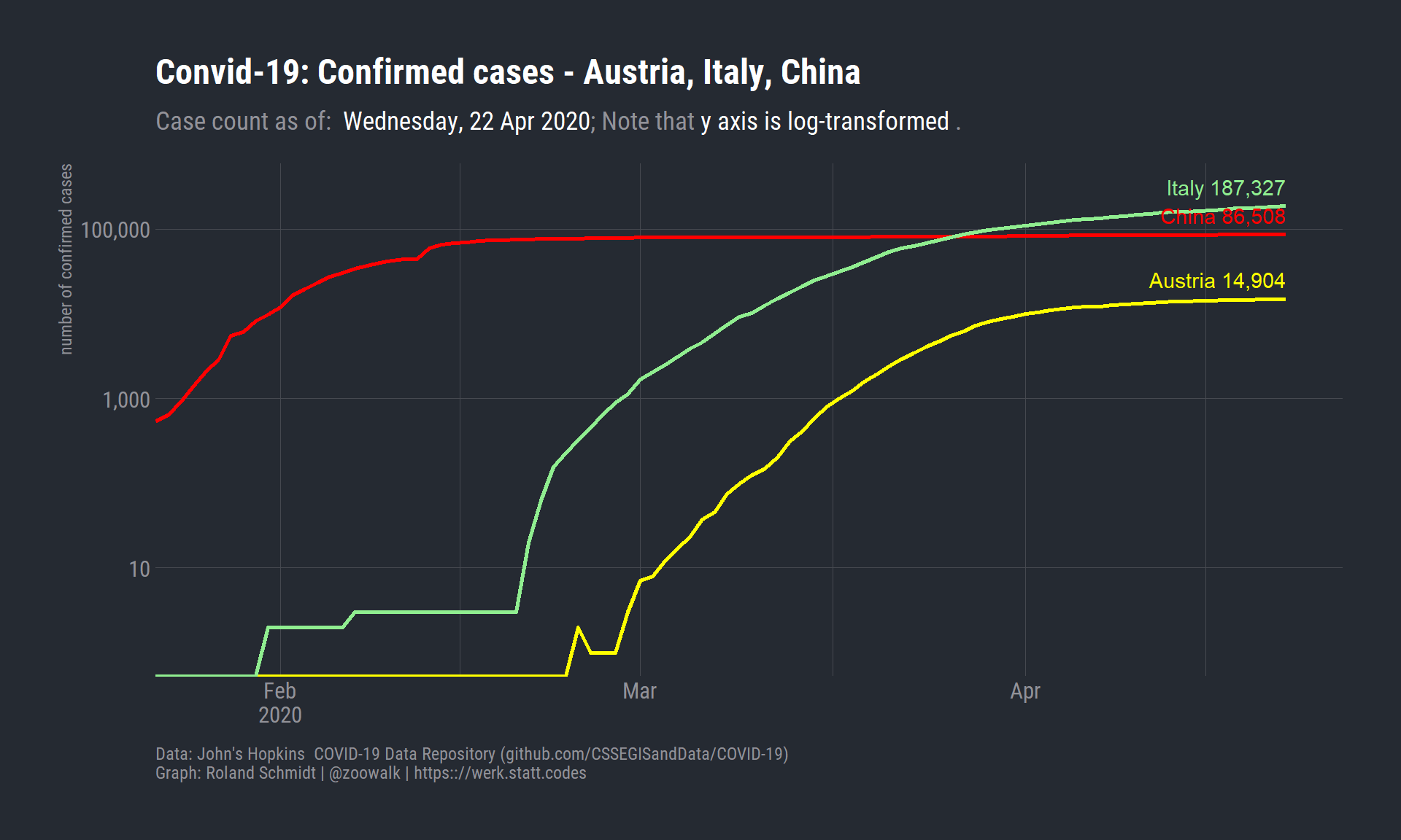
To put the Austrian case somewhat into perspective I contrast its numbers with those of Italy and China. The former is the worrying neighbor, representing a scenario which is within the realm of the possible for Austria. Since the absolute number of confirmed cases are quite different, I scaled the numbers on a log scale (note the labels on the y axis).
Click to see code plot
plots_3countries <- df_corona_long %>%filter(str_detect(country_region, "Austria|Italy|China")) %>%ggplot()+labs(title="Convid-19: Confirmed cases - Austria, Italy, China",subtitle=glue("Case count as of: ", "<span style='color:white'> {format(max(df_corona_long$date), '%A, %d %b %Y')}</span>", "; ","Note that <span style='color:white'>y axis is log-transformed </span>.","\n"),caption=c("Data: John's Hopkins COVID-19 Data Repository (github.com/CSSEGISandData/COVID-19)","\nGraph: Roland Schmidt | @zoowalk | https:://werk.statt.codes"),y="number of confirmed cases")+geom_line(aes(x=date,y=n_obs,color=country_region),size=1)+geom_text(data=. %>%filter(date==max(df_corona_long$date)),aes(x=date,y=n_obs*1.7,label=paste(country_region, scales::comma(n_obs)),color=country_region,hjust=1))+scale_x_date(breaks=scales::date_breaks(width="1 month"),labels = scales::label_date_short(),expand=expansion(mult=c(0, 0.05)))+scale_y_log10(labels=scales::label_comma())+scale_color_manual(values=country_color)+theme_ft_rc()+theme(legend.position="none",plot.caption =element_text(hjust=c(0, 0)),panel.grid.minor.y =element_blank(),plot.subtitle =element_markdown(),axis.title.x =element_blank())
In my view, the graph shows quite clearly the staggering dynamic of the virus’ spread in Italy. On 20 February, there were only 3 confirmed cases. 10 days later, the number had already risen to 1694 (check the table above for the exact numbers). The graph also shows the flattening curve in China, an indication for the gradual slowdown of the dynamic. As for Austria, the absolute numbers are as of the time of writing still comparably modest, however, there is a clear, steep upward trajectory.
3 Comparing Austria’s and Italy’s dynamics
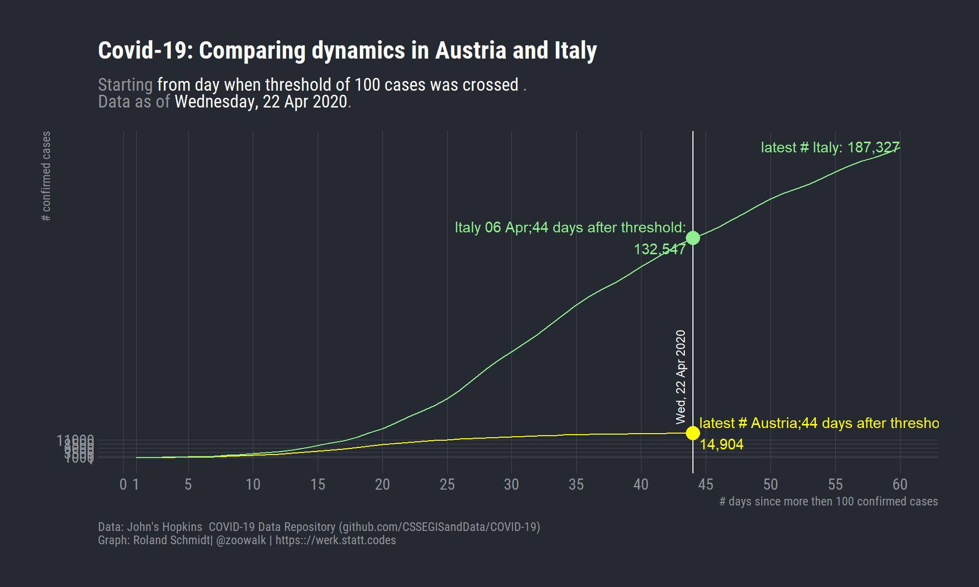
To better contrast both countries’ dynamics, I’ll replace the dates on the x-axis with an index which indicates the number of days which have passed since the virus’ outbreak in each country. This raises the question when the disease actually breaks out. What is the adequate starting position to contrast the disease’s development? The presence of one single case? Or more? Taking the presence of only one case may easily be a distorting threshold since in one country the presence of one case might have been missed for some time. Consequently, the ensuing dynamic might appear steeper than in a country which did not miss the first case. I assume epidemiologists have clear concepts on this, but for my purpose I start the index from the day the threshold of 100 cases is crossed. In the cases of Italy and Austria, this threshold was crossed on the following dates:
Click to see code to set threshold and create index
# A tibble: 2 × 2
# Groups:   country_region [2]
  country_region date
  <chr>          <date>
1 Austria        2020-03-10
2 Italy          2020-02-23
To overlap the lines for Austria and Italy, we have to replace the dates of the x-axis with a common index. As a starting point for this index, I chose the day when the number of 100 confirmed cases was crossed for the first time. That’s what the first code block does. The second block produces the graph.
Click to see code for plot
pl_AT_IT <- df_AT_IT %>%# filter(threshold_indicator>0) %>% # mutate(day_index=row_number()) %>% ggplot()+geom_vline(xintercept=df_AT_IT %>%filter(country_region=="Austria") %>%pull(day_index) %>%max(),color="white")+geom_text(data=. %>%filter(country_region=="Austria") %>%tail(1),aes(x=day_index,y=20000,label =format(date, '%a, %d %b %Y')),color ="white",angle =90,nudge_x =-1,size=3,hjust =0)+geom_line(aes(x=day_index,y=n_obs,color=country_region))+geom_point(data=. %>%filter(day_index==max(df_AT_IT$day_index[df_AT_IT$country_region=="Austria"])),aes(x=day_index,size=2,y=n_obs,color=country_region))+labs(title="Covid-19: Comparing dynamics in Austria and Italy",subtitle=glue("Starting <span style='color:white'>from day when threshold of {threshold_value} cases was crossed </span>.<br>Data as of <span style='color:white'>{format(max(df_AT_IT$date), '%A, %d %b %Y')}</span>."),caption=c("Data: John's Hopkins COVID-19 Data Repository (github.com/CSSEGISandData/COVID-19)","\nGraph: Roland Schmidt| @zoowalk | https:://werk.statt.codes"),x=glue("# days since more then {threshold_value} confirmed cases"),y="# confirmed cases")+scale_x_continuous(limits=c(1, NA),breaks=c(1, seq(0, max(df_AT_IT$day_index), 5)),minor_breaks =NULL)+scale_color_manual(values=country_color)+geom_text(data=. %>%filter(day_index==max(df_AT_IT$day_index[df_AT_IT$country_region=="Austria"]) & country_region=="Austria"),aes(x=day_index,y=n_obs,color=country_region,label=paste0("latest # Austria;", day_index, " days after threshold:", "\n",comma(n_obs))),nudge_x =0.5,nudge_y=250,check_overlap = T,hjust=0,show.legend = F)+geom_text(data=. %>%filter(day_index==max(df_AT_IT$day_index[df_AT_IT$country_region=="Austria"])& country_region=="Italy"),aes(x=day_index,y=n_obs,color=country_region,label=paste0("Italy ", format(date, '%d %b'), ";", day_index, " days after threshold:", "\n", comma(n_obs))),nudge_x =-0.5,nudge_y=500,check_overlap = T,hjust=1,show.legend = F)+geom_text(data=. %>%filter(date==as.Date(max(df_AT_IT$date)) & country_region=="Italy"),aes(x=day_index,y=n_obs,color=country_region,label=paste0("latest # Italy: ", comma(n_obs))),nudge_x =0,nudge_y=500,check_overlap = T,hjust=1,show.legend = F)+scale_y_continuous(limits=c(1, NA),minor_breaks =NULL,breaks=c(1, seq(1000, 12000, 2500)))+theme_ft_rc()+theme(legend.position ="none",#legend.justification = "left",plot.subtitle =element_markdown(),plot.caption =element_text(hjust=c(0, 0)),legend.title=element_blank())
Overall, the graph below suggests that Austria is on a somewhat slower trajectory than Italy. Contrasting both countries’ absolute numbers on the latest index day (44th day as of 22 April, Italy featured already 132,547 cases. In contrast, Austria featured 14,904 confirmed cases.
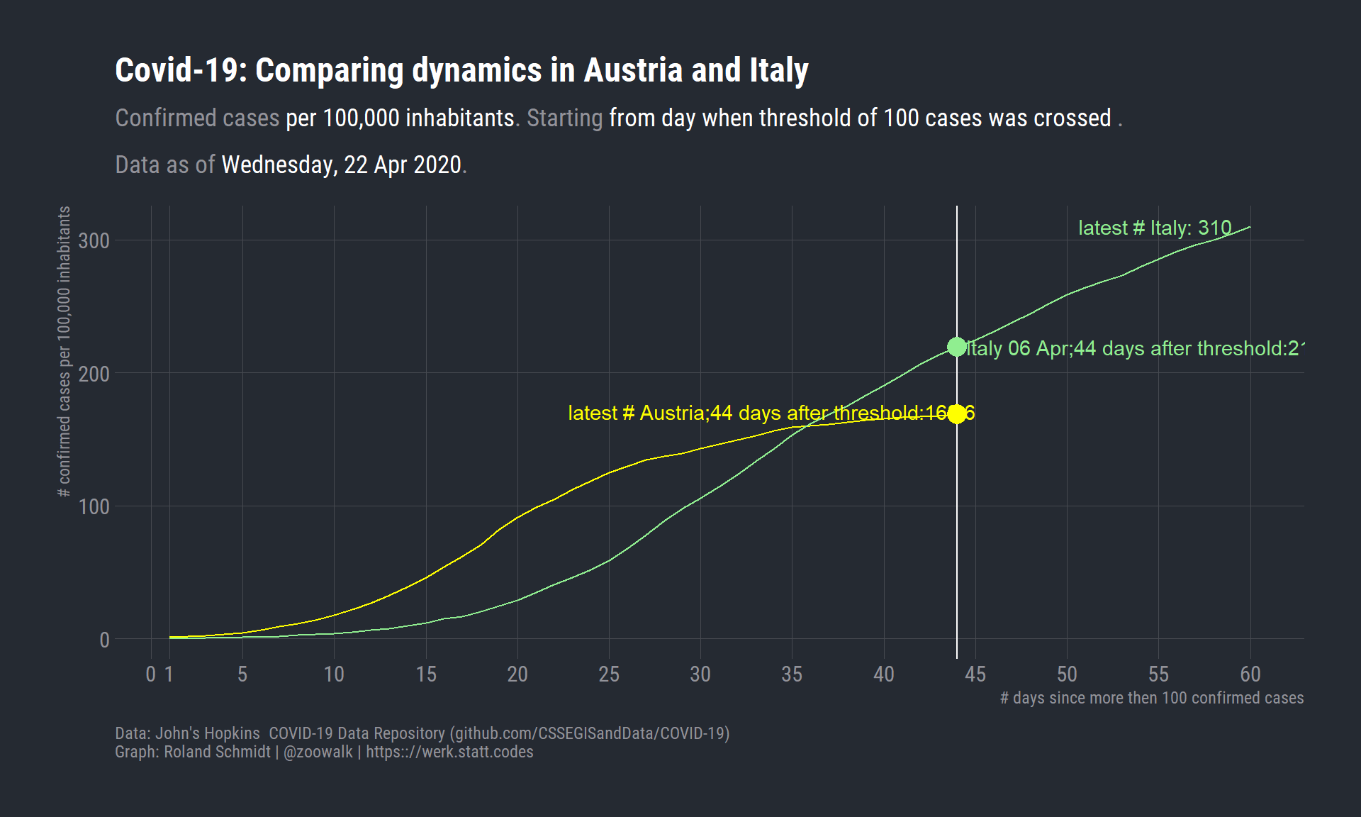
4 Correcting infection numbers for population size
Critically, one may adjust the number of confirmed cases with the population size of the country. The graph below presents the modified result.
I retrieve Italy’s and Austria’s population data from the World Bank’s pertaining database, accessed via the wbstats package.
Click to see code for plot
pop_data <-wb(indicator ="SP.POP.TOTL", startdate =2018, enddate =2018) %>%filter(str_detect(country, "Austria|Italy"))df_AT_IT <- df_AT_IT %>%left_join(., pop_data %>%select(country, pop.size=value),by=c("country_region"="country")) %>%mutate(n_obs_rel=n_obs/(pop.size/100000)) pl_AT_IT_rel <- df_AT_IT %>%ggplot()+geom_vline(xintercept=df_AT_IT %>%filter(country_region=="Austria") %>%pull(day_index) %>%max(),color="white")+geom_line(aes(x=day_index,y=n_obs_rel,color=country_region))+geom_point(data=. %>%filter(day_index==max(df_AT_IT$day_index[df_AT_IT$country_region=="Austria"])),aes(x=day_index,size=2,y=n_obs_rel,color=country_region))+labs(title="Covid-19: Comparing dynamics in Austria and Italy",subtitle=glue("Confirmed cases <span style='color:white'>per 100,000 inhabitants</span>. Starting <span style='color:white'>from day when threshold of {threshold_value} cases was crossed </span>.\nData as of <span style='color:white'>{format(max(df_AT_IT$date), '%A, %d %b %Y')}</span>."),caption=c("Data: John's Hopkins COVID-19 Data Repository (github.com/CSSEGISandData/COVID-19)","\nGraph: Roland Schmidt | @zoowalk | https:://werk.statt.codes"),x=glue("# days since more then {threshold_value} confirmed cases"),y="# confirmed cases per 100,000 inhabitants")+scale_x_continuous(limits=c(1, NA),breaks=c(1, seq(0, max(df_AT_IT$day_index), 5)),minor_breaks =NULL)+scale_color_manual(values=country_color)+geom_text(data=. %>%filter(day_index==max(df_AT_IT$day_index[df_AT_IT$country_region=="Austria"]) & country_region=="Austria"),aes(x=day_index,y=n_obs_rel,color=country_region,label=paste0("latest # Austria;", day_index, " days after threshold:", round(n_obs_rel, 1))),nudge_x =1,nudge_y=2,check_overlap = T,hjust=1,show.legend = F)+geom_text(data=. %>%filter(day_index==max(df_AT_IT$day_index[df_AT_IT$country_region=="Austria"])& country_region=="Italy"),aes(x=day_index,y=n_obs_rel,color=country_region,label=paste0("Italy ", format(date, '%d %b'), ";", day_index, " days after threshold:", round(n_obs_rel, 1))),nudge_x =0.5,nudge_y=0,check_overlap = T,hjust=0,show.legend = F)+geom_text(data=. %>%filter(date==as.Date(max(df_AT_IT$date)) & country_region=="Italy"),aes(x=day_index,y=n_obs_rel,color=country_region,label=paste0("latest # Italy: ", round(n_obs_rel, 1))),nudge_x =-1,check_overlap = T,hjust=1,show.legend = F)+#scale_y_percent(labels = scales::label_percent(accuracy=0.001))+scale_y_continuous(minor_breaks =NULL)+theme_ft_rc()+theme(legend.position ="none",#legend.justification = "left",plot.subtitle =element_markdown(lineheight = .5),plot.caption =element_text(hjust=c(0, 0)),legend.title=element_blank())
Correcting for the population size, Austria’s trajectory starts to look more worrying. While Italy had 219 persons infected with Covid-19 on the 44 day of the outbreak (if we take the aforementioned threshold), Austria only a considerably larger figure of 169.
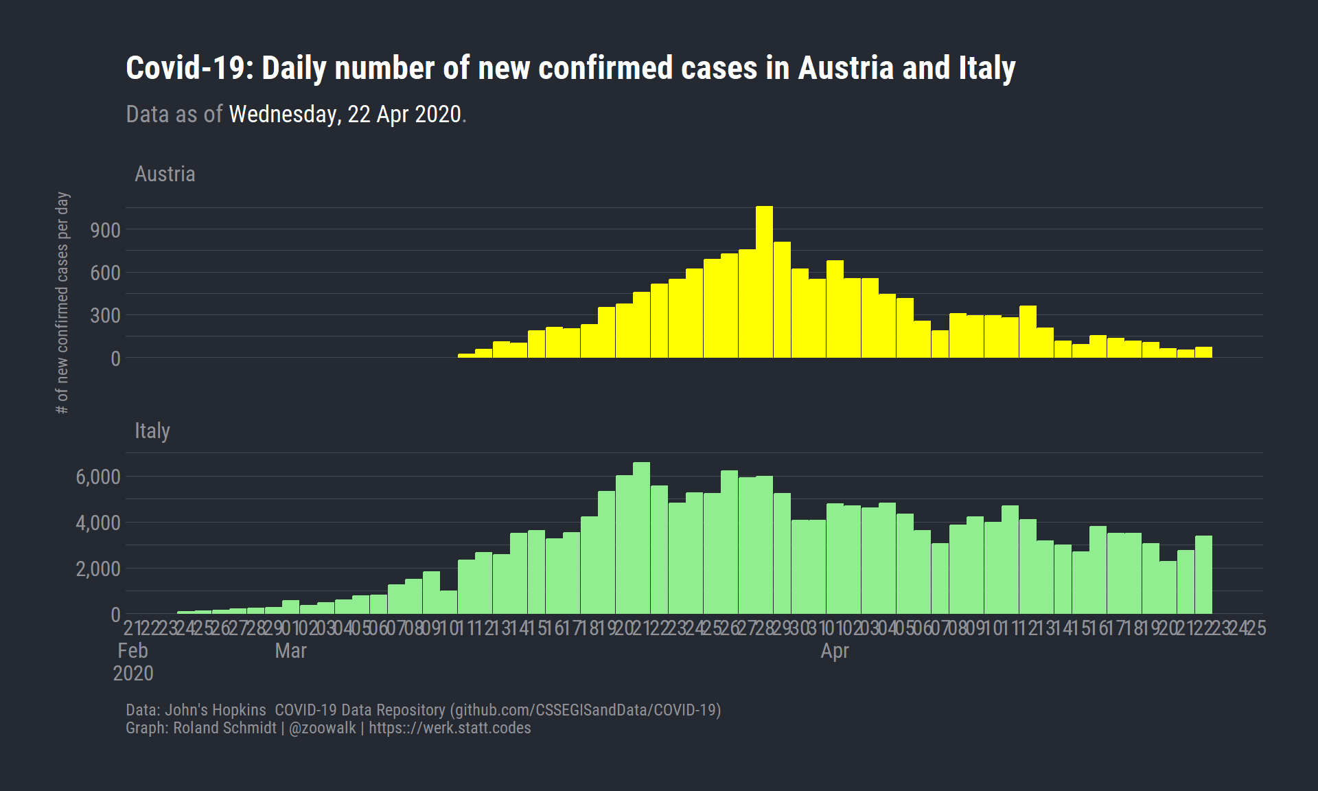
5 Absolute number of new infections
Let’s contrast the absolute number of newly confirmed infections from day to day.
Click to see code
df_new_infections <- df_AT_IT %>%group_by(country_region) %>%arrange(date, .by_group=T) %>%mutate(new_infections=n_obs-lag(n_obs)) %>%mutate(max_new_infections=max(new_infections, na.rm = T)) %>%filter(threshold_indicator>0) %>%mutate(day_index=row_number()) %>%ggplot()+labs(title="Covid-19: Daily number of new confirmed cases in Austria and Italy",subtitle=glue("Data as of <span style='color:white'>{format(max(df_AT_IT$date), '%A, %d %b %Y')}</span>."),caption=c("Data: John's Hopkins COVID-19 Data Repository (github.com/CSSEGISandData/COVID-19)","\nGraph: Roland Schmidt | @zoowalk | https:://werk.statt.codes"),y="# of new confirmed cases per day")+geom_bar(aes(x=date,y=new_infections,color=country_region,fill=country_region),stat="identity")+# geom_text(data=. %>% filter(day_index %% 2 != 0 ),# aes(x=date,# y=max_new_infections*1.1,# color=country_region,# label=scales::comma(new_infections,# accuracy=1),# fill=country_region),# stat="identity")+# geom_text(data=. %>% filter(day_index %% 2 == 0 ),# aes(x=date,# y=max_new_infections*1.3,# color=country_region,# label=scales::comma(new_infections,# accuracy=1),# fill=country_region),# stat="identity")+facet_wrap(vars(country_region),scales="free_y",nrow=2)+scale_y_continuous(labels=scales::label_comma(accuracy =1),expand=expansion(mult=c(0, 0.1)))+scale_fill_manual(values=country_color)+scale_color_manual(values=country_color)+scale_x_date(labels=scales::label_date_short(),breaks=breaks_width(width ="1 day"))+theme_ft_rc()+theme(legend.position ="none",axis.title.x =element_blank(),panel.grid.major.x =element_blank(),panel.grid.minor.x =element_blank(),plot.subtitle =element_markdown(lineheight = .5),plot.caption =element_text(hjust=c(0, 0)),legend.title=element_blank())
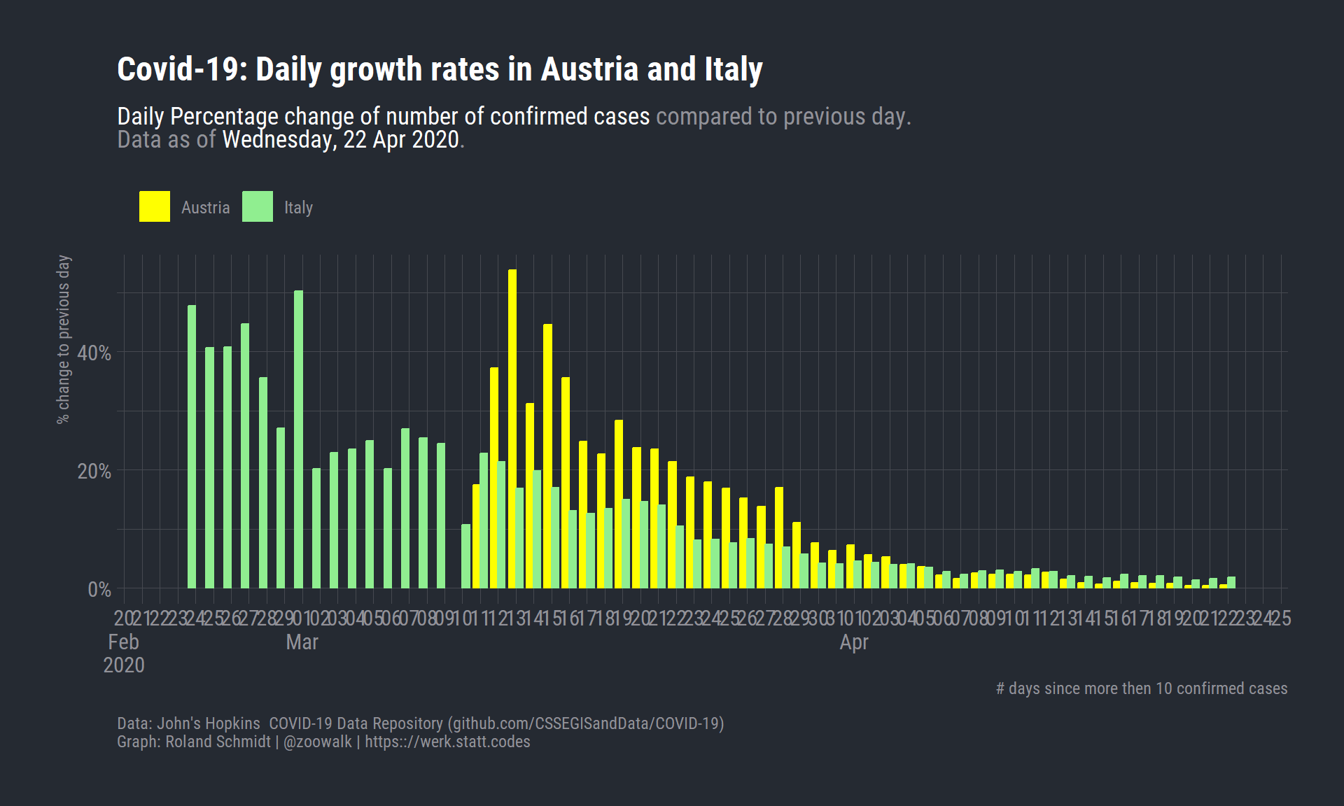
6 Growth rates
What if we look at the increase in relative terms, as growth rates:
Click to see code
# growth rates --------------------------------------------------------------pl_growth <- df_corona_long %>%filter(str_detect(country_region, "Austria|Italy")) %>%mutate(threshold_indicator=case_when(n_obs>threshold_value ~1,TRUE~0)) %>%group_by(country_region) %>%arrange(date, .by_group=T) %>%filter(threshold_indicator>0) %>%mutate(day_index=row_number()) %>%mutate(n_obs_prior=lag(n_obs)) %>%mutate(change=(n_obs-n_obs_prior)/n_obs_prior) %>%ungroup() %>%ggplot()+labs(title="Covid-19: Daily growth rates in Austria and Italy",subtitle=glue("<span style='color:white'>Daily Percentage change of number of confirmed cases</span> compared to previous day.<br>Data as of <span style='color:white'>{format(max(df_AT_IT$date), '%A, %d %b %Y')}</span>."),caption=c("Data: John's Hopkins COVID-19 Data Repository (github.com/CSSEGISandData/COVID-19)","\nGraph: Roland Schmidt | @zoowalk | https:://werk.statt.codes"),x="# days since more then 10 confirmed cases",x="date",y="% change to previous day")+geom_bar(aes(x=date,y=change,fill=country_region,group=country_region,color=country_region),width =0.8,stat ="identity",position=position_dodge(preserve="single"))+scale_y_continuous(labels=scales::label_percent(scale=100))+scale_fill_manual(values=country_color)+scale_color_manual(values=country_color)+scale_x_date(labels=scales::label_date_short(),minor_breaks =NULL,breaks=scales::date_breaks(width="1 day"),guide =guide_axis(n.dodge=1))+theme_ft_rc()+theme(legend.position ="top",legend.justification ="left",plot.subtitle =element_markdown(lineheight = .5),plot.caption =element_text(hjust=c(0, 0)),legend.title=element_blank())
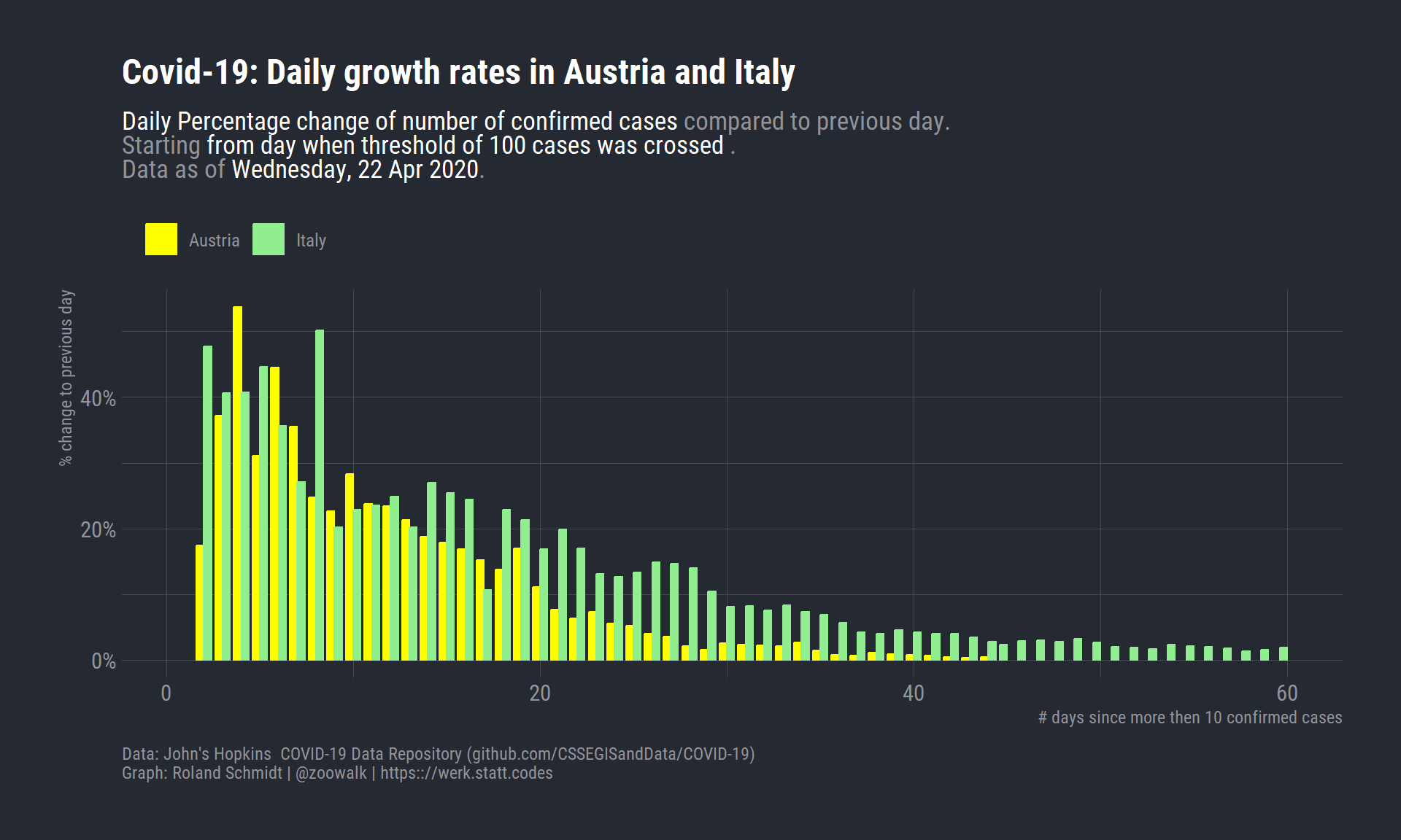
7 Growth rates synced
Click to see code
# > growth rates on index axis ----------------------------------------------pl_growth_index <- df_corona_long %>%filter(str_detect(country_region, "Austria|Italy")) %>%mutate(threshold_indicator=case_when(n_obs>threshold_value ~1,TRUE~0)) %>%group_by(country_region) %>%arrange(date, .by_group=T) %>%filter(threshold_indicator>0) %>%mutate(day_index=row_number()) %>%mutate(n_obs_prior=lag(n_obs)) %>%mutate(change=(n_obs-n_obs_prior)/n_obs_prior) %>%#filter(date>as.Date("2020-03-01")) %>% ungroup() %>%ggplot()+labs(title="Covid-19: Daily growth rates in Austria and Italy",subtitle=glue("<span style='color:white'>Daily Percentage change of number of confirmed cases</span> compared to previous day. <br>Starting <span style='color:white'>from day when threshold of {threshold_value} cases was crossed </span>. <br>Data as of <span style='color:white'>{format(max(df_AT_IT$date), '%A, %d %b %Y')}</span>."),caption=c("Data: John's Hopkins COVID-19 Data Repository (github.com/CSSEGISandData/COVID-19)","\nGraph: Roland Schmidt | @zoowalk | https:://werk.statt.codes"),x="# days since more then 10 confirmed cases",x="date",y="% change to previous day")+geom_bar(aes(x=day_index,y=change,fill=country_region,group=country_region,color=country_region),width =0.8,stat ="identity",position=position_dodge(preserve="single"))+scale_y_continuous(labels=scales::label_percent(scale=100))+scale_fill_manual(values=country_color)+scale_color_manual(values=country_color)+theme_ft_rc()+theme(legend.position ="top",legend.justification ="left",plot.subtitle =element_markdown(lineheight = .5),plot.caption =element_text(hjust=c(0, 0)),legend.title=element_blank())